Brodo
A bar for its own crowd: a name rooted in design and an identity that changes with the evening.
Naming and identity
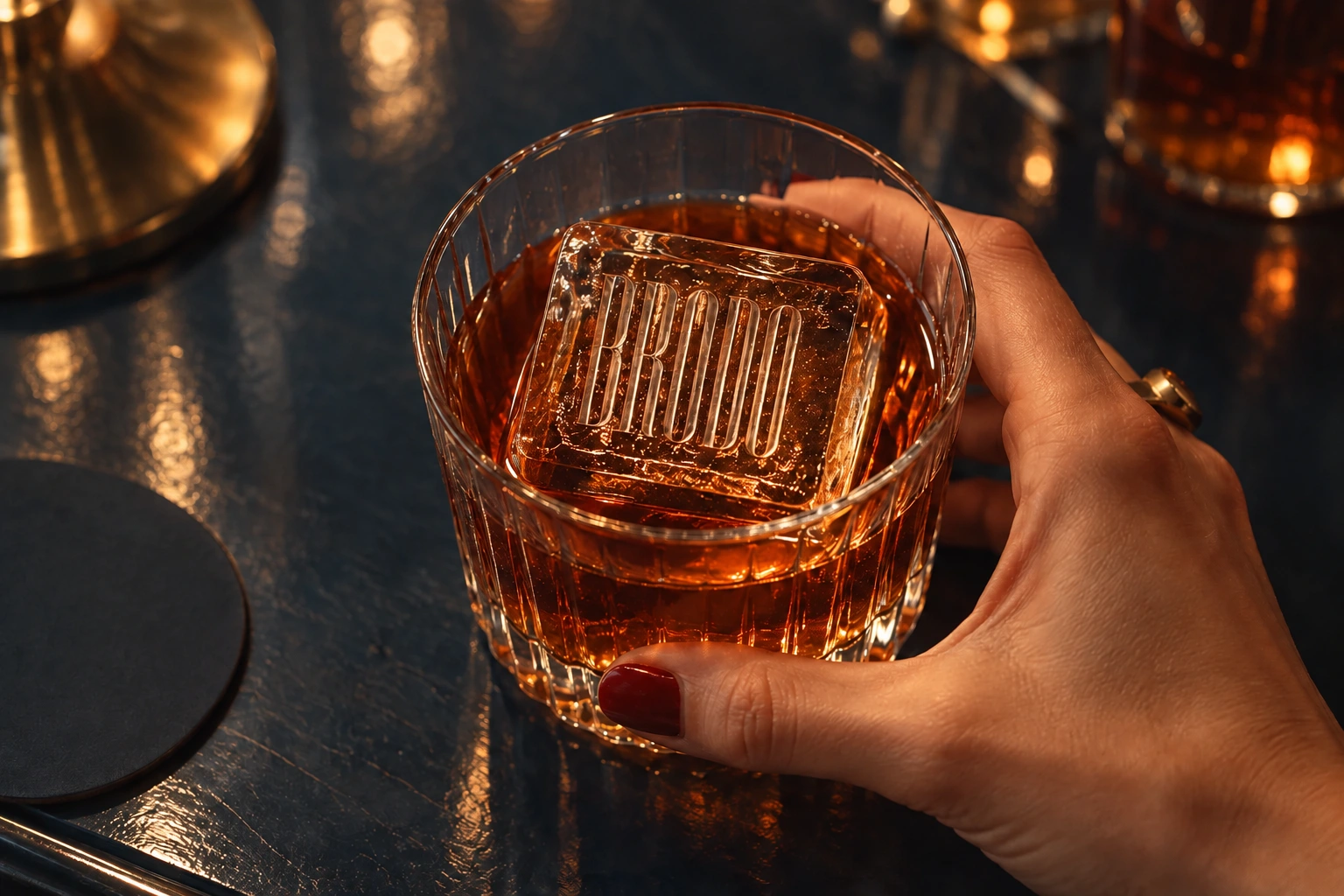
Hedonism with a sense of humour.
The original brief brought together Art Deco, comfort and self-ironic snobbery. The bar needed the character of a place for its own circle of friends.
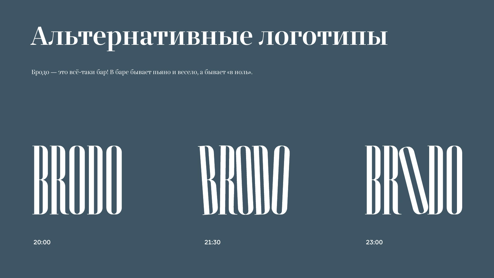
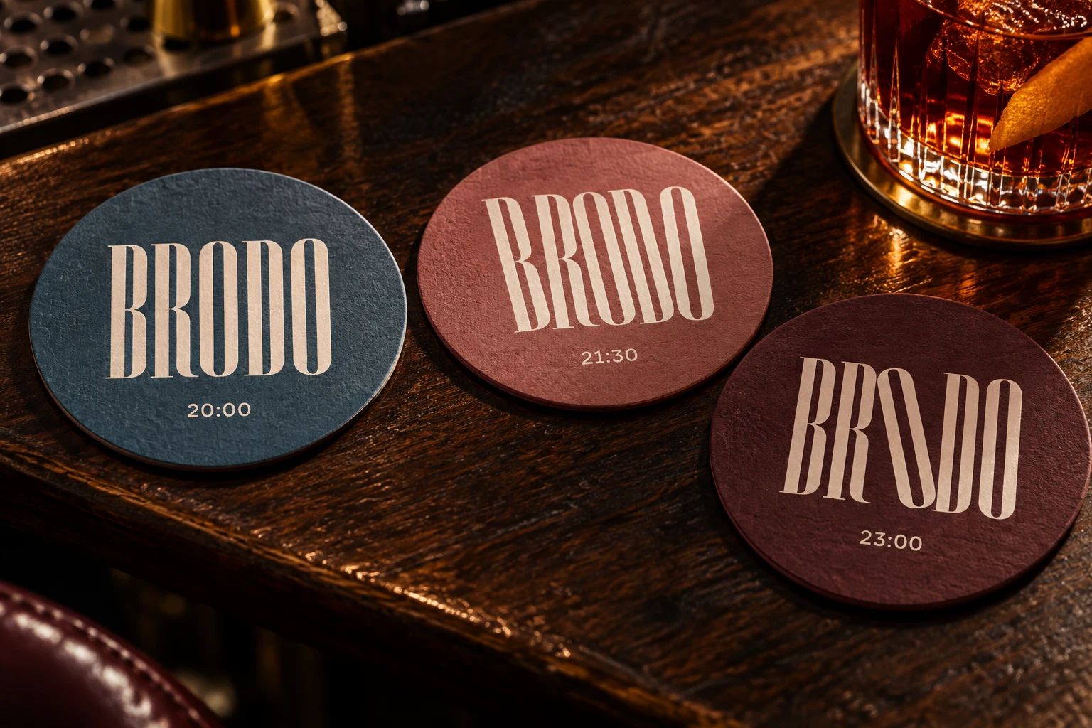
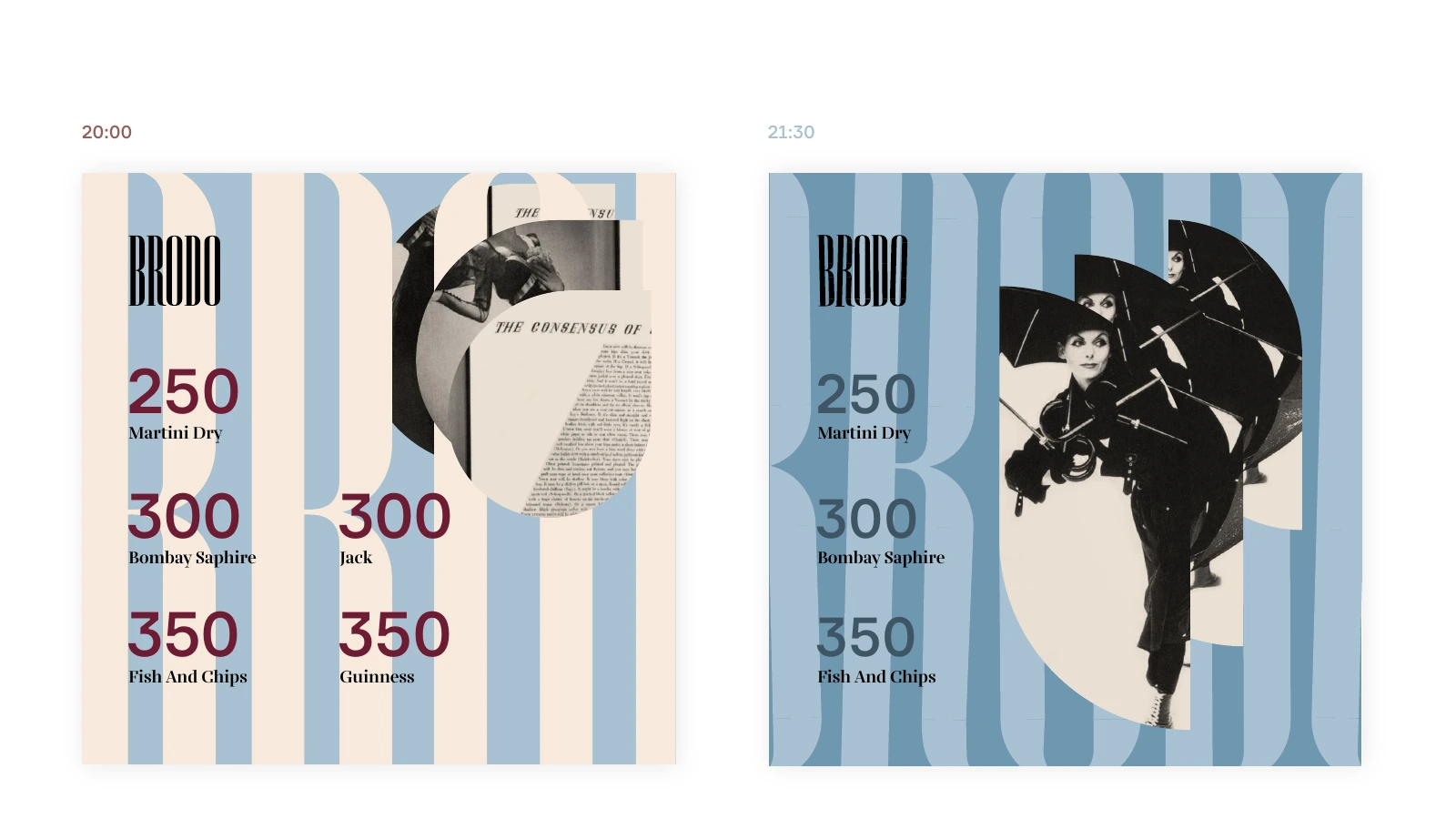
Brodo refers to Alexey Brodovitch and opens an editorial language of expressive typography, photography and free cropping. The logo follows an evening schedule, changing its slant at 20:00, 21:30 and 23:00.
Three moments in an evening
Three logo versions change their slant while retaining the name’s drawing. This is defined variation: a message can change mood within one system.
A name opens a graphic language
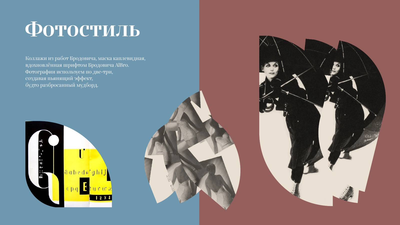
Brodo retains its reference to Alexey Brodovitch. His editorial culture provided the research foundation: large typography, photography and free cropping.
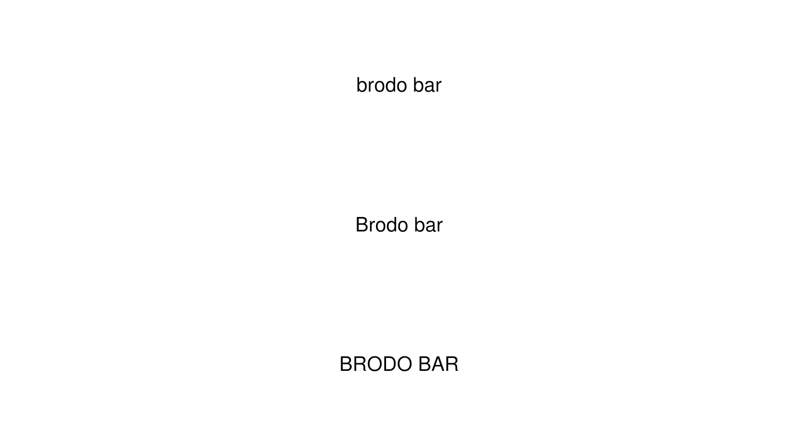
Expression and usability
The guide separates expressive headlines, body text and menu numerals. Warm and cool palettes vary the tone without losing the bar’s character.
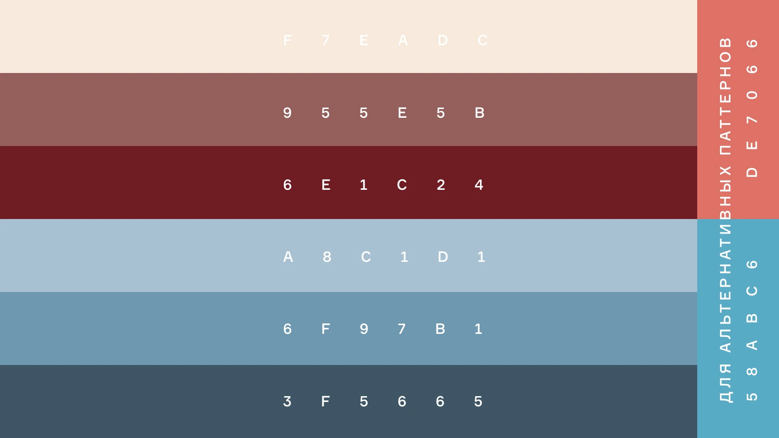
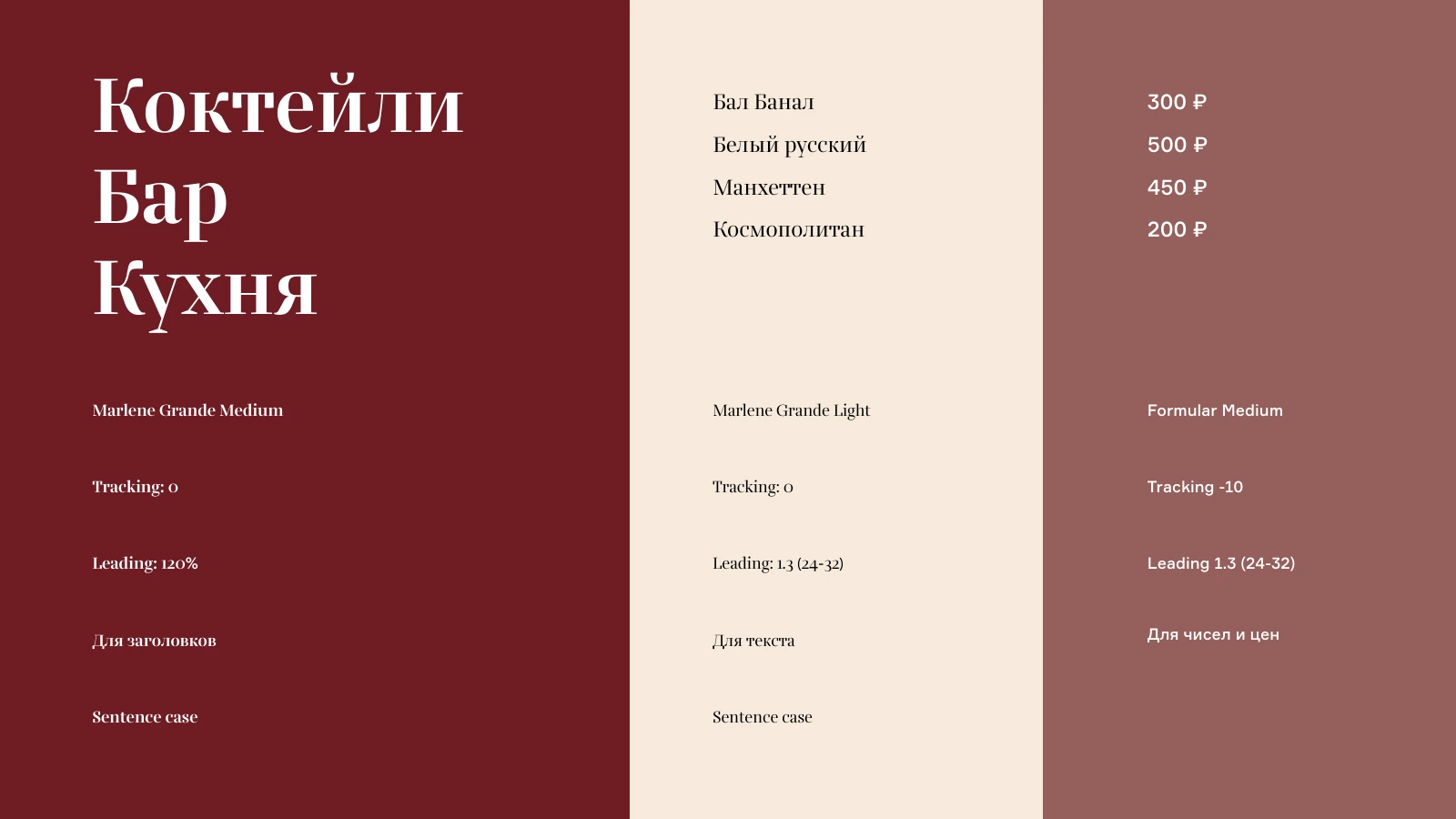
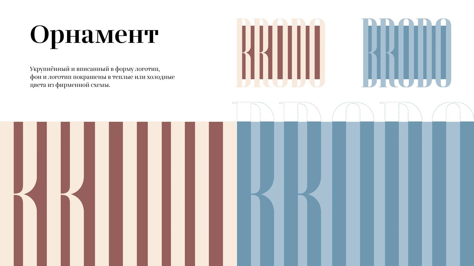
Two sources for patterns
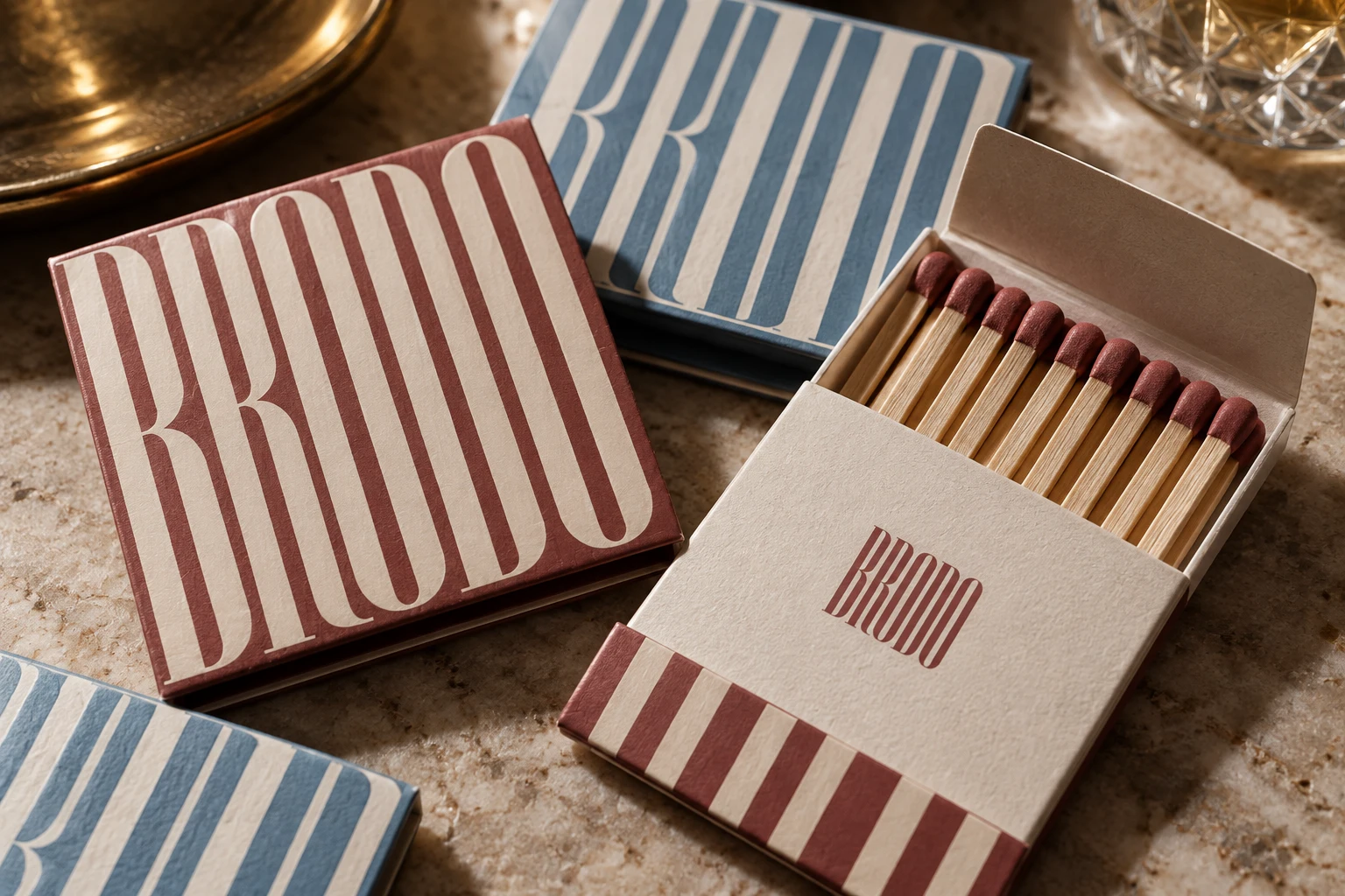
One pattern comes from enlarged, cropped logo letters. Another comes from details of the interior chandelier. Both connect graphics with the venue’s character.
An editorial principle
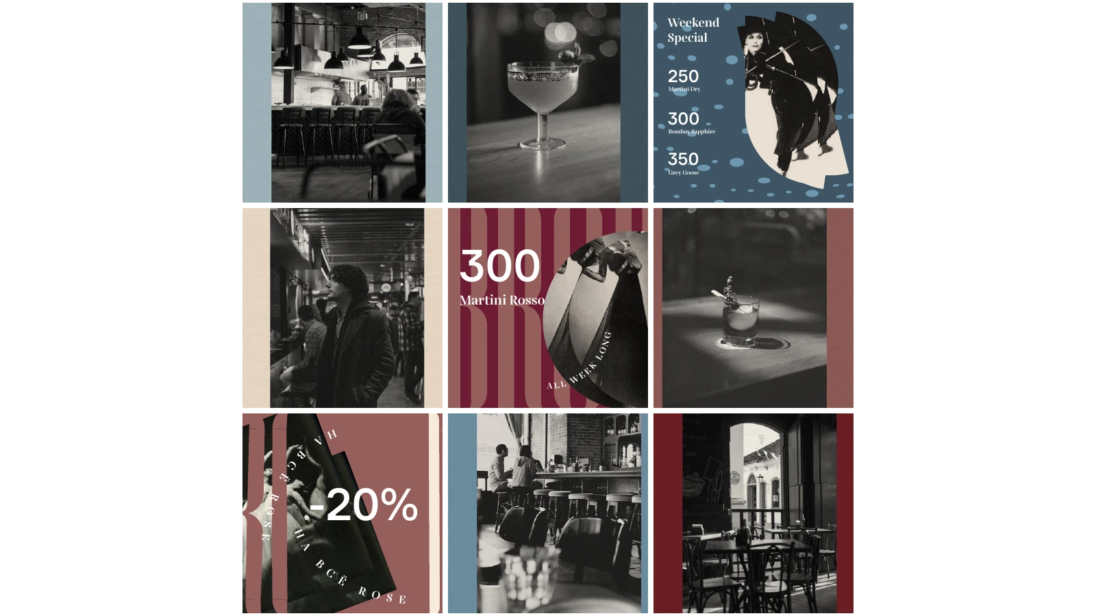
A teardrop mask refers to Brodovitch’s AlBro. Overlays, offsets and a shared treatment allow different photographs to follow one composition rule.
A menu that can be updated
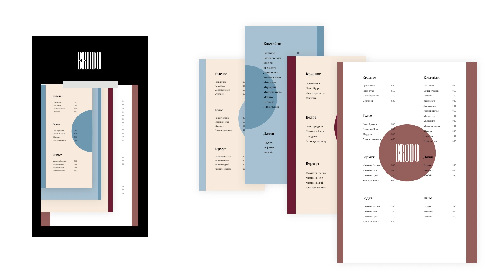
The exploration included a magazine format and a board with replaceable sheets. The latter separates food, bar and wine menus so they can be updated independently.
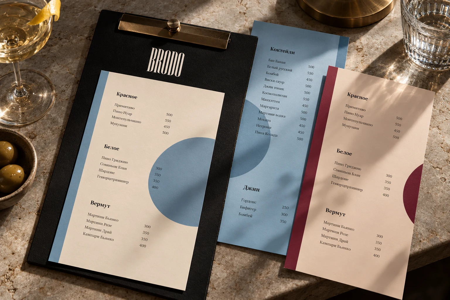
One communication voice
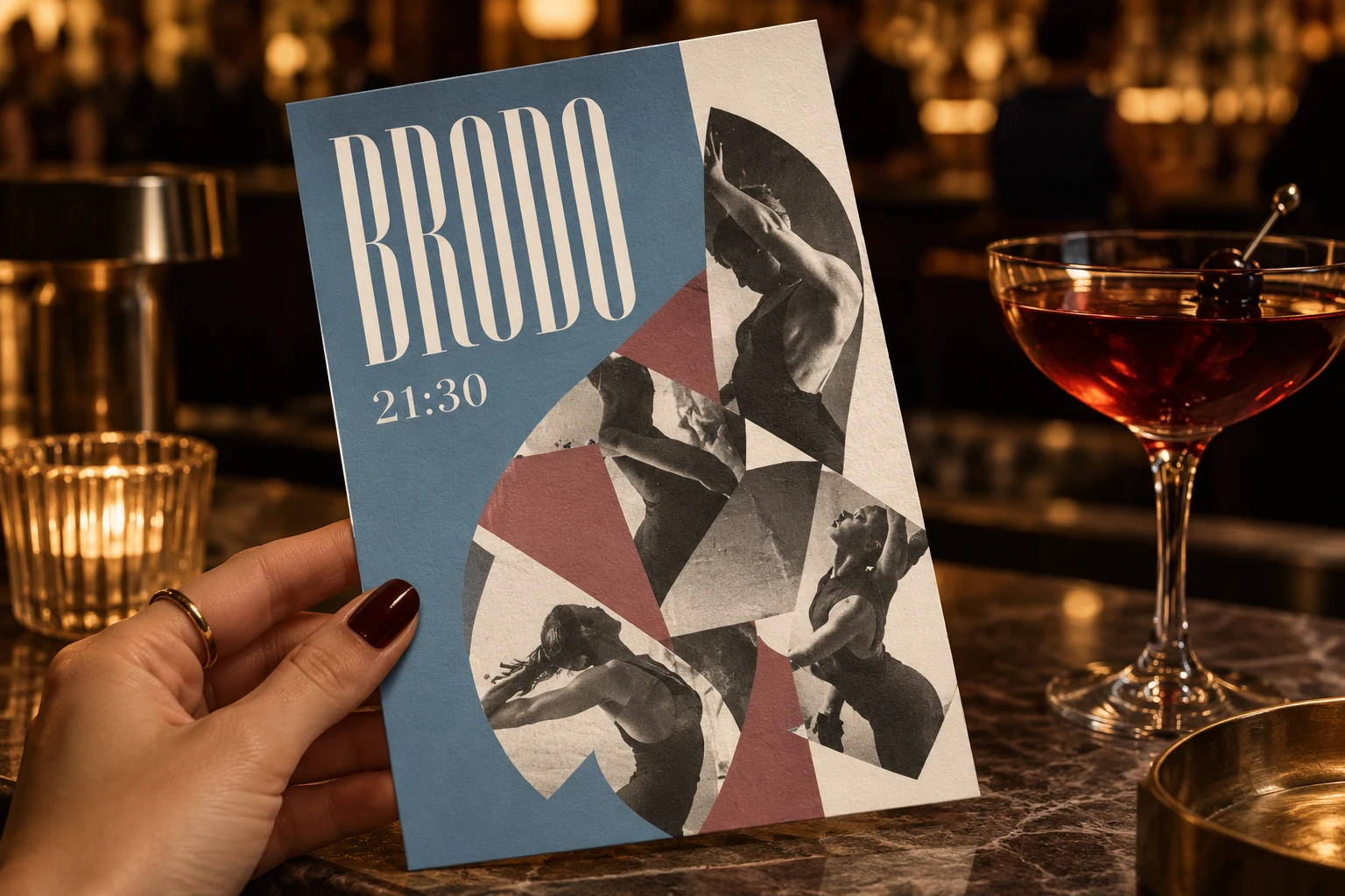
Table displays and posts share composition rules. The occasion changes, while typography, stripes and photographic collage retain Brodo’s tone.
Explore the process and early alternatives
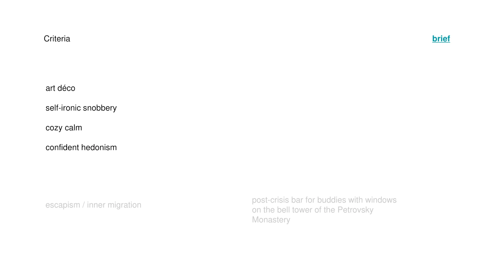
Character as a criterion
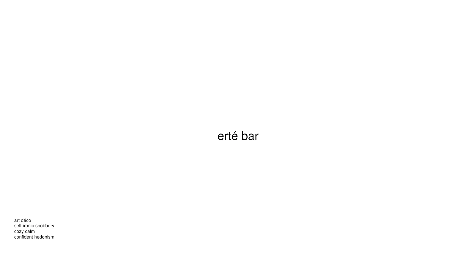
Art Deco, comfort and self-ironic snobbery guided the search. The name needed to support a place for one’s own circle and an evening apart from city noise.
Naming directions
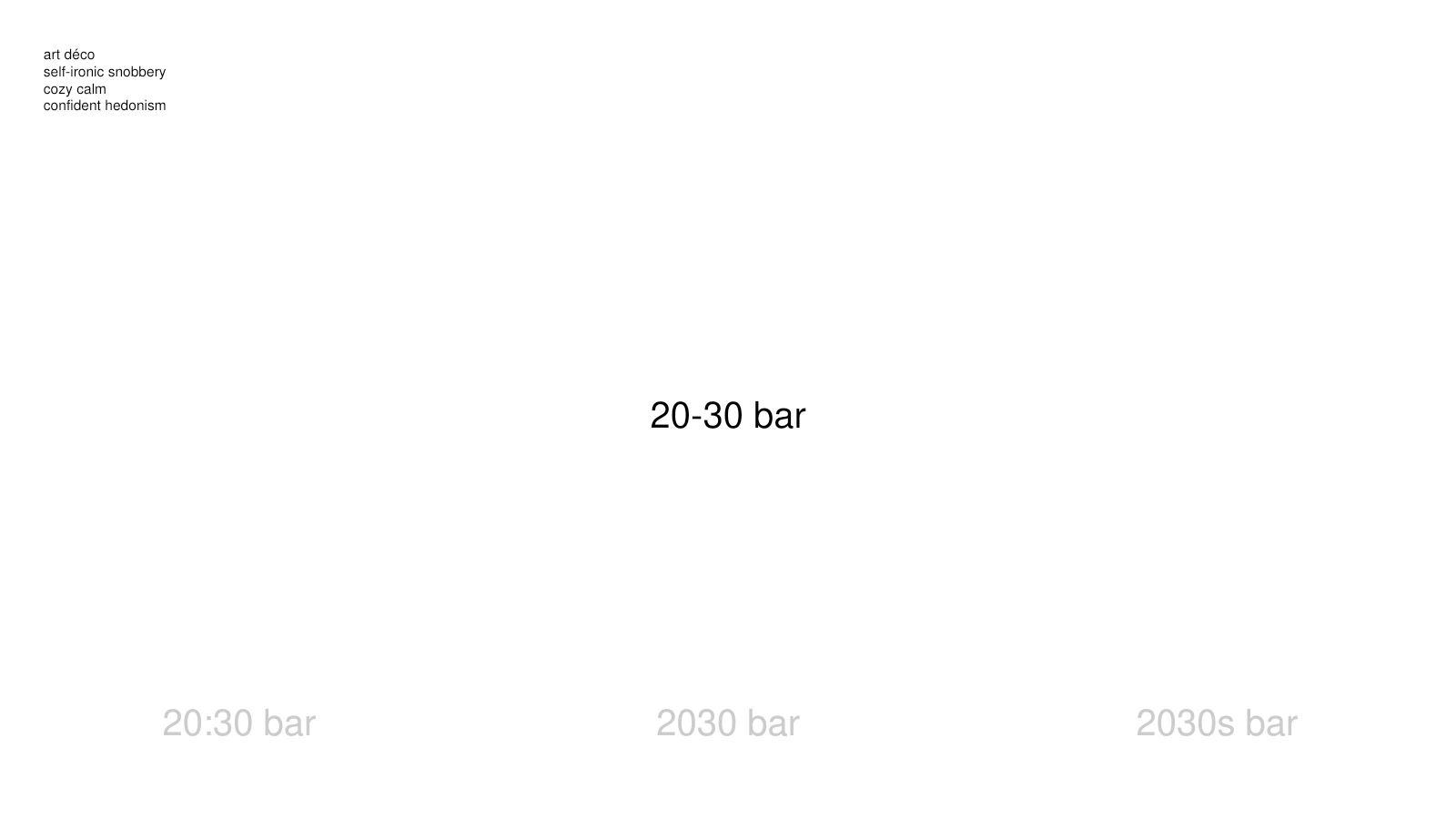
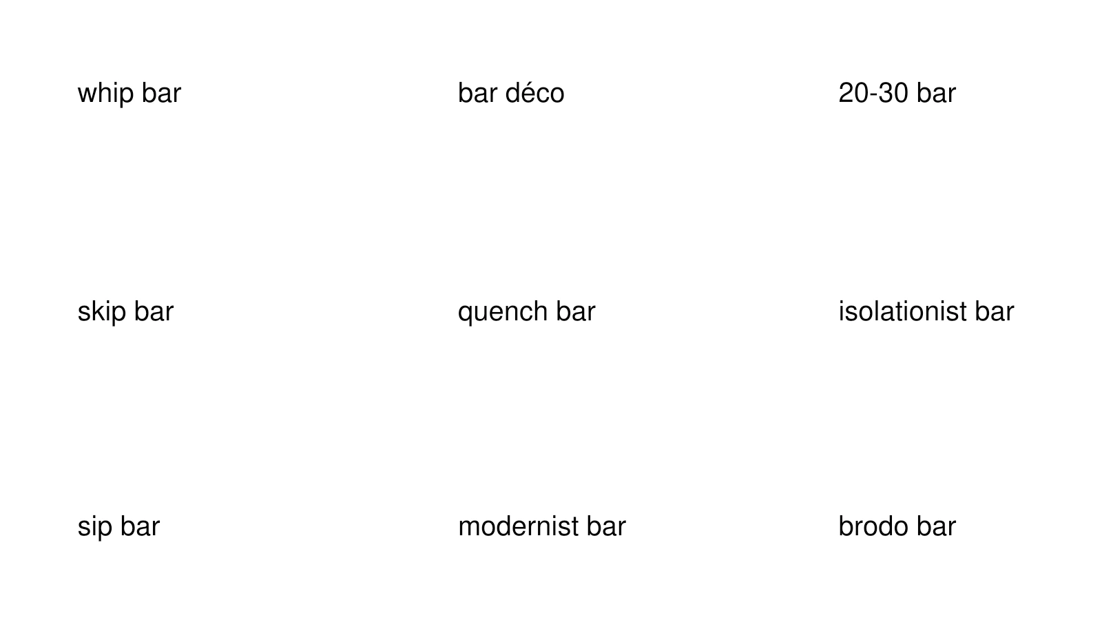
Erté and Déco referred to an artistic era; 20–30 and 20:30 linked it to evening hours. Sip, Whip and Quench explored a bar vocabulary; Modernist and Isolationist addressed the venue’s character.
What the project delivered
The Brodo name, three logo states, typography, palette, photography direction and applications from menus to posts.
RequiemLight, form and motion