Sberdrug
One system for Sberbank’s internal services: find what you need, complete the task and get back to work.
Design director
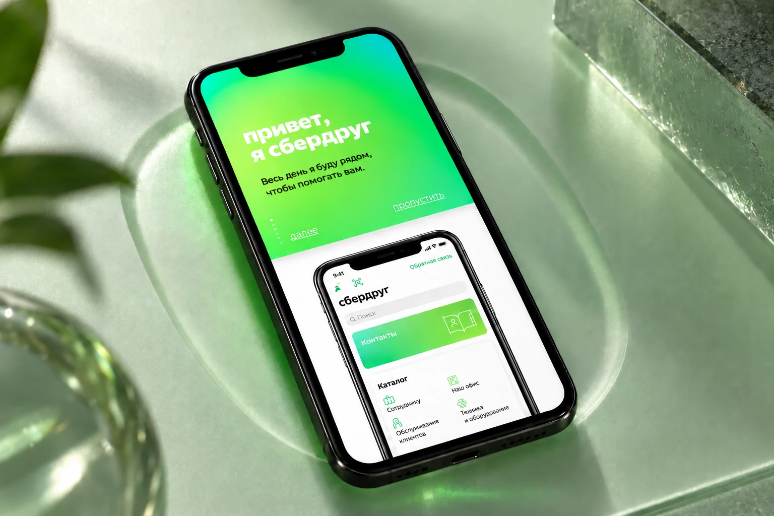
Connect a task with its solution.
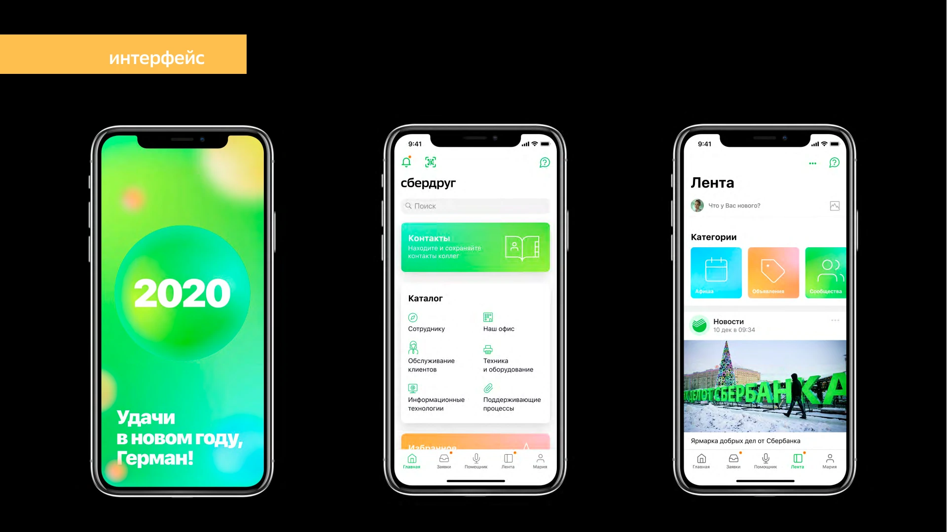
An internal service should help employees spend less time using it. The SberDrug guide called for a clear purpose on each screen, enough information and useful feedback.
As design director, I led the identity, design system and interface. An atom brought the services together; plain language, colour-coded categories and shared rules shaped a coherent working tool. The project began in 2019, before Sberbank’s rebrand.
Services become one system
The atom shifted the emphasis from joining two points to uniting internal services. The explored form changed, while the principle of quick, comfortable task completion remained.
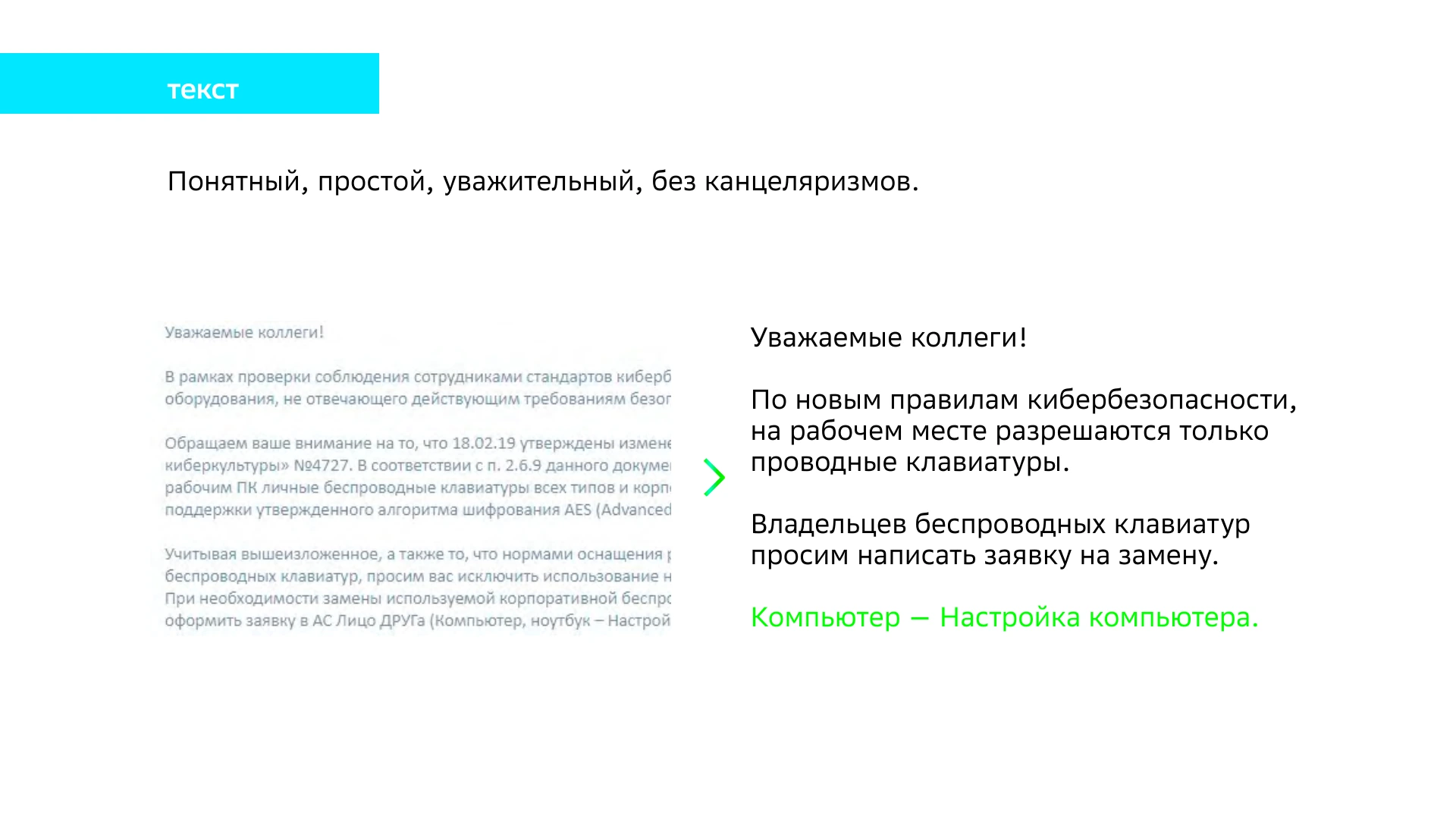
Respect for time as a design rule
The guide-manifesto calls for simple layouts, sufficient information and copy without bureaucratic language. Design helps complete an action instead of keeping people in the app.
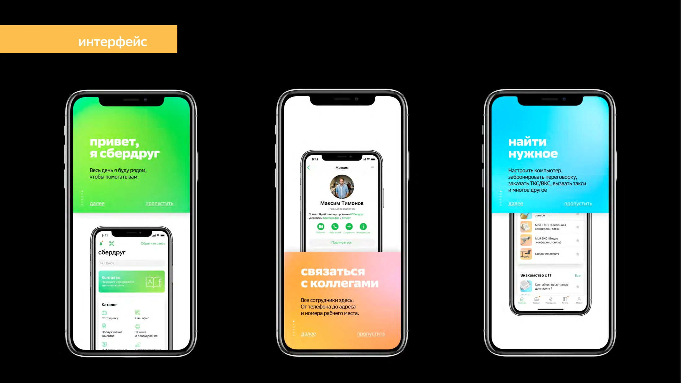
One atom per screen
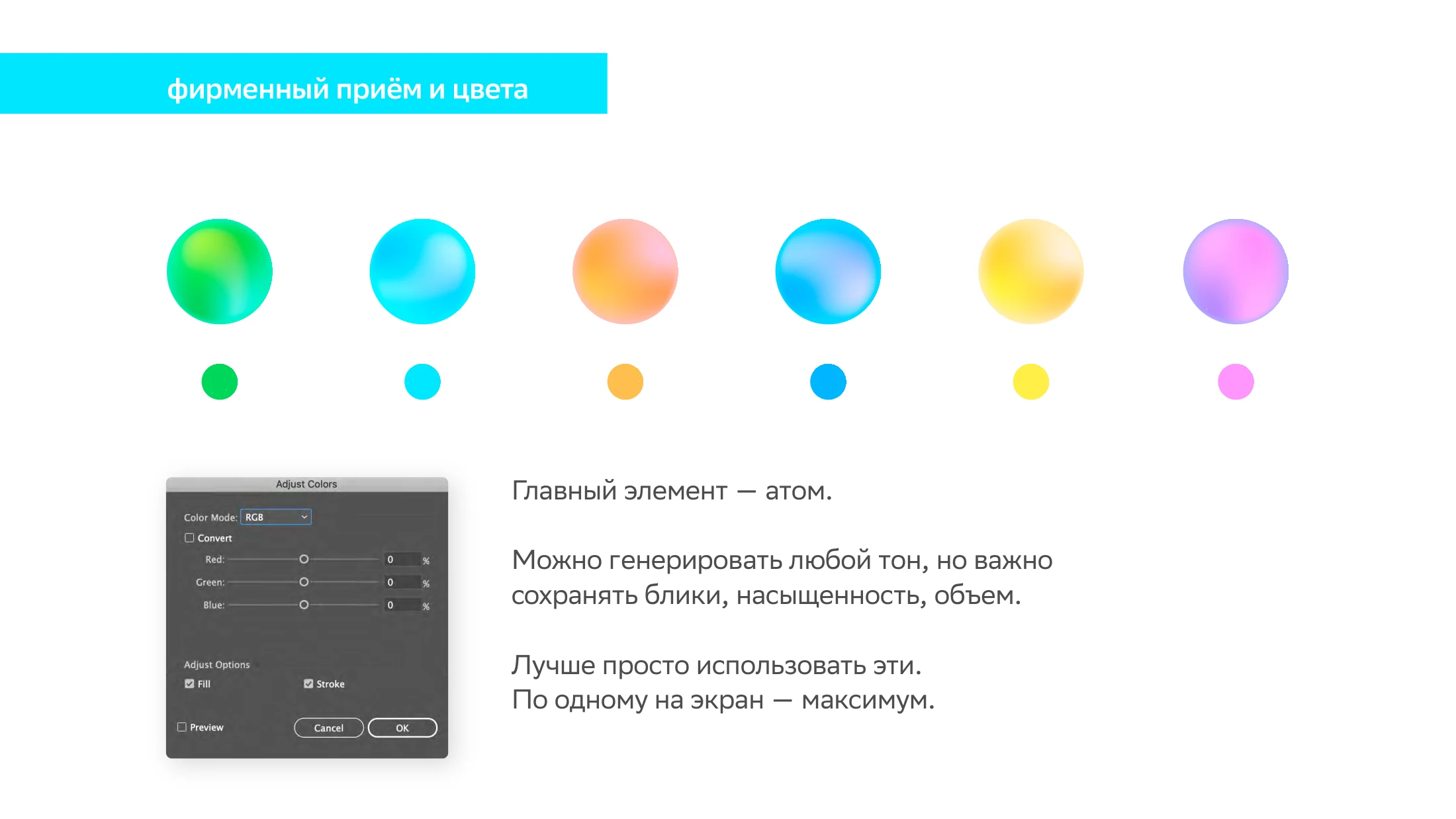
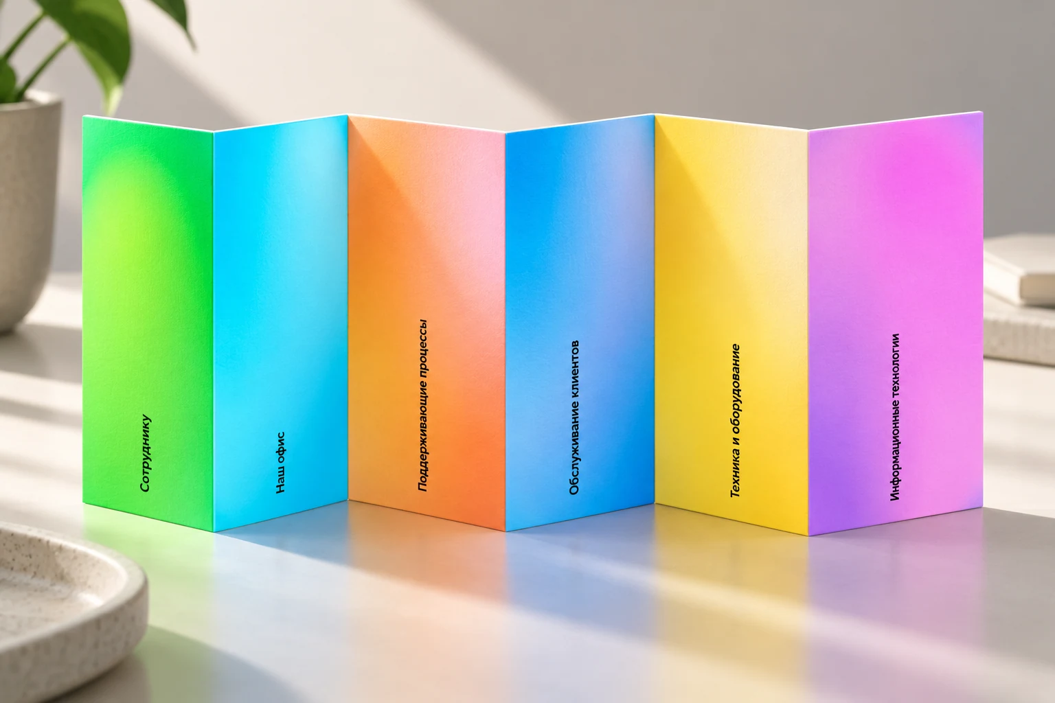
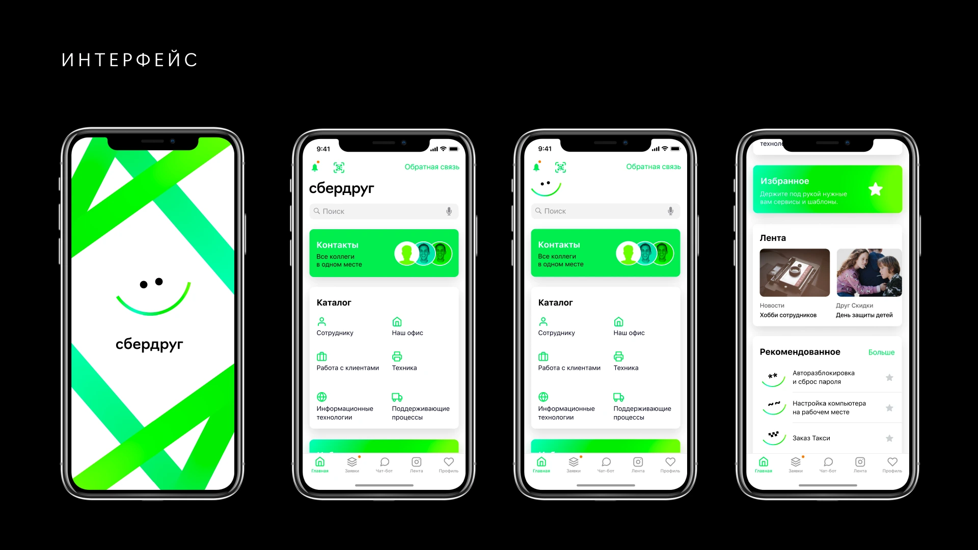
The atom’s colours distinguish catalogue sections. A limit of one per screen protects interface hierarchy; outside the product the palette allows more freedom.
Consistent elements
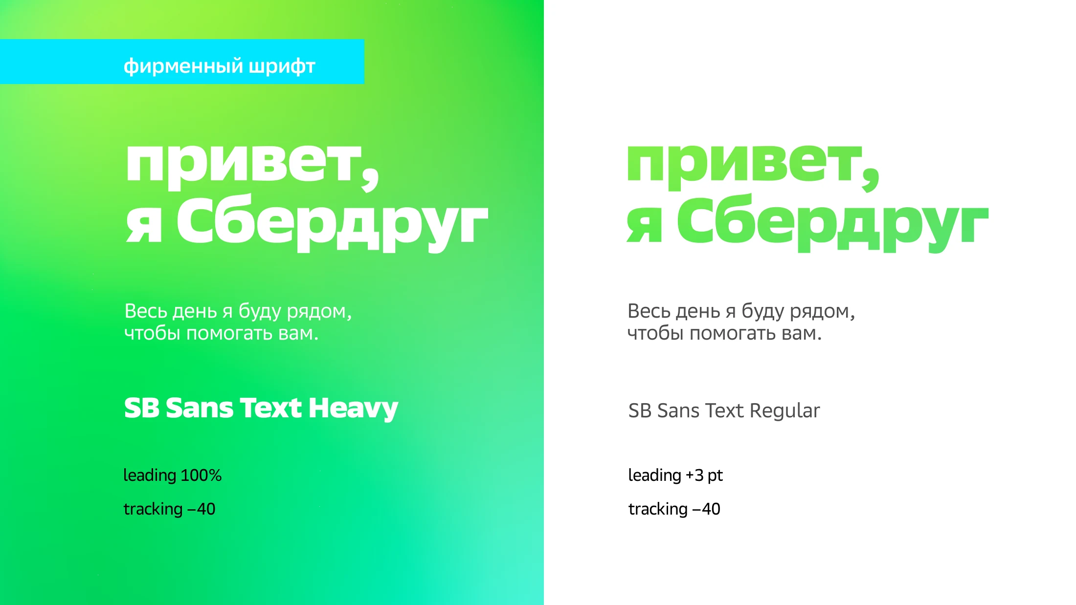
SB Sans Text assigns roles to headlines and explanations. Icons use a 10 × 10 grid and line weights related to the typeface.
Explore the process and early alternatives
A guide through the working day
The platform’s role was defined through everyday employee tasks. Clear actions, short copy and feedback became criteria for both identity and interface.
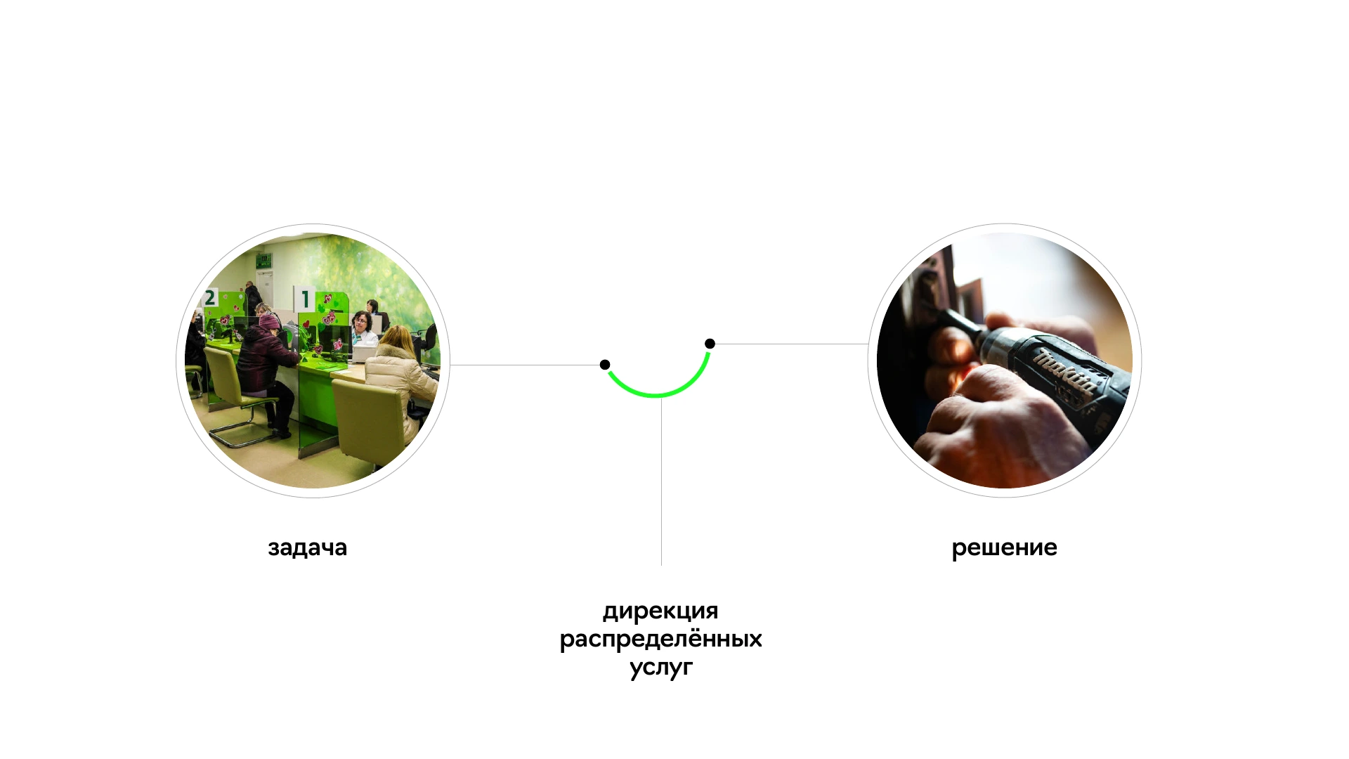
Exploration: a connecting link
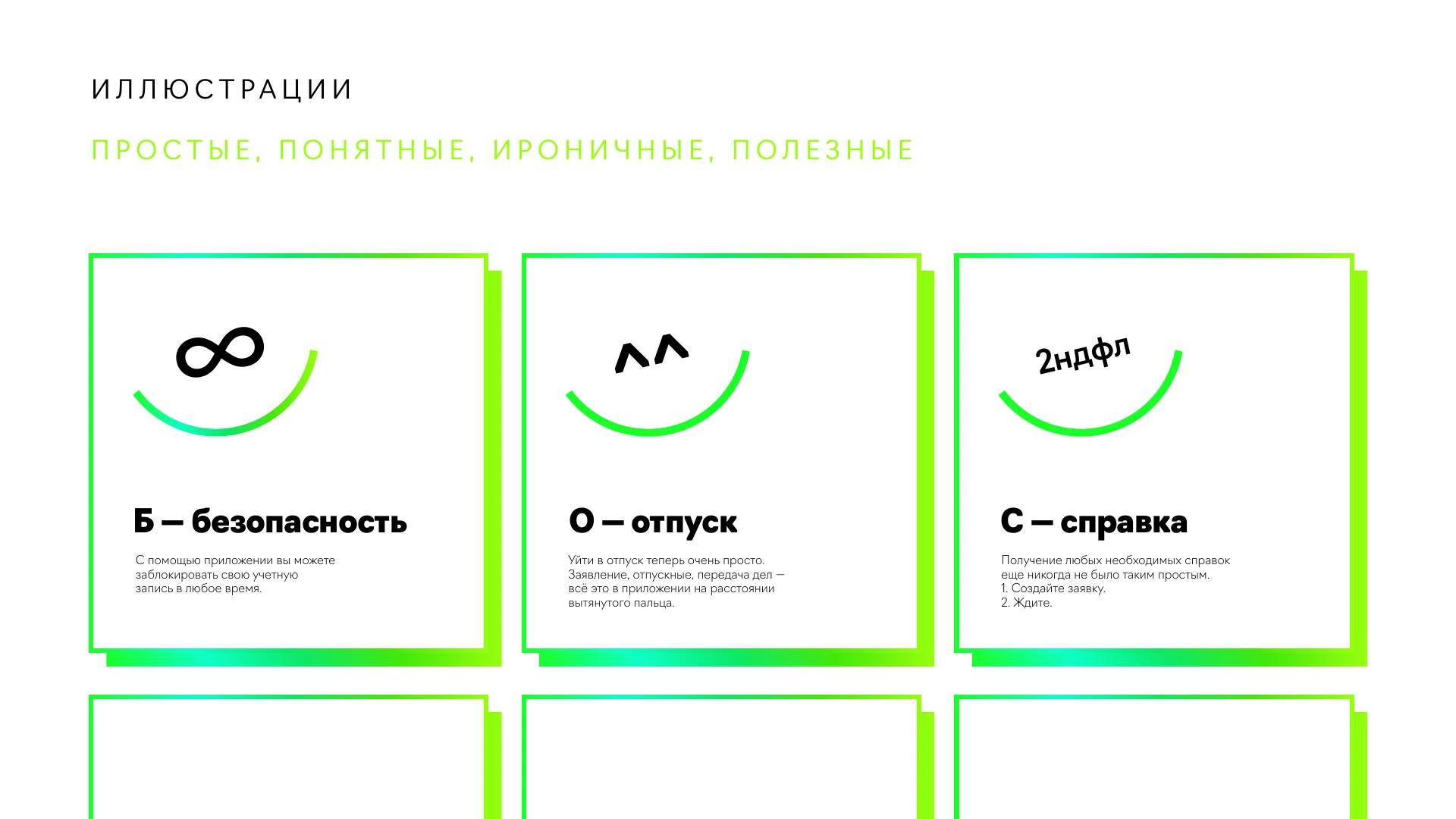
During exploration, a line joined the necessary points and a smile gave technology a human character. Simple symbols varied its expression. This was an exploration preceding the final system.
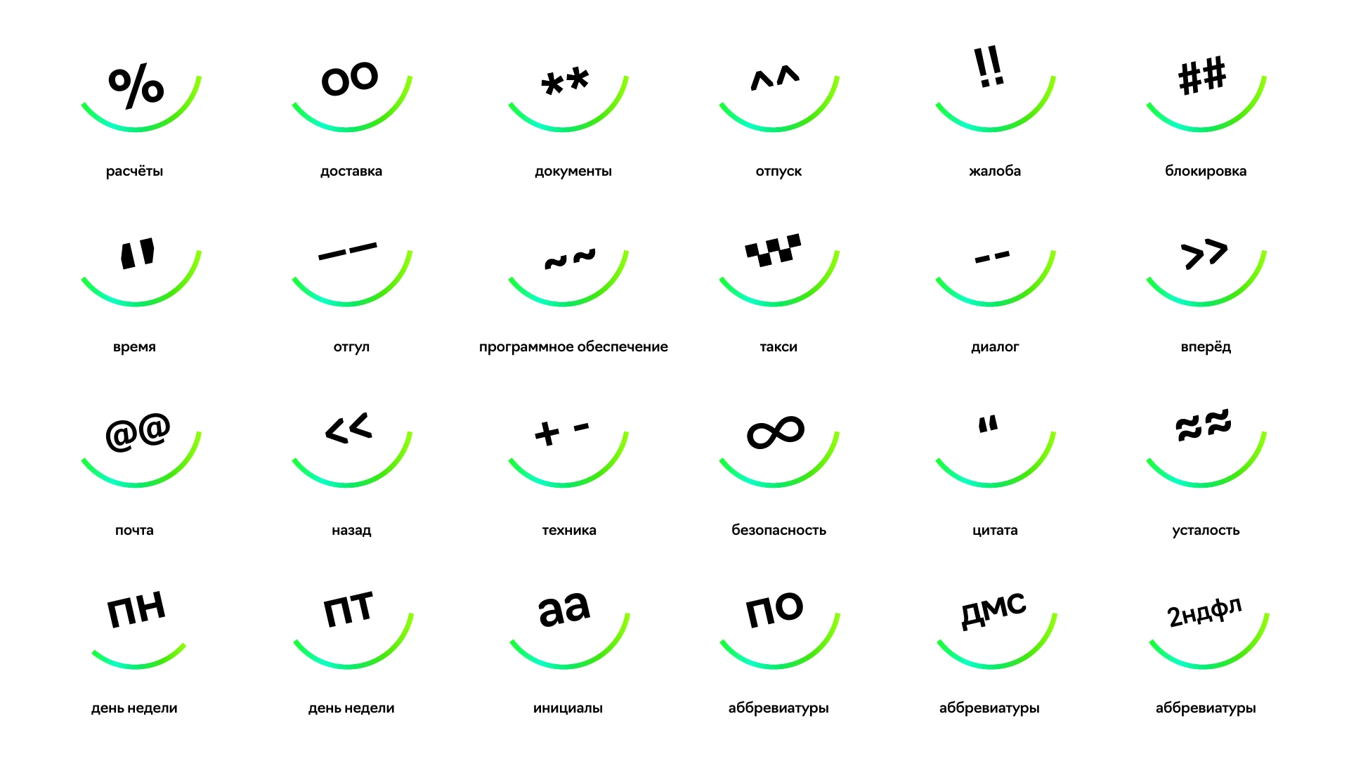
A distinct voice
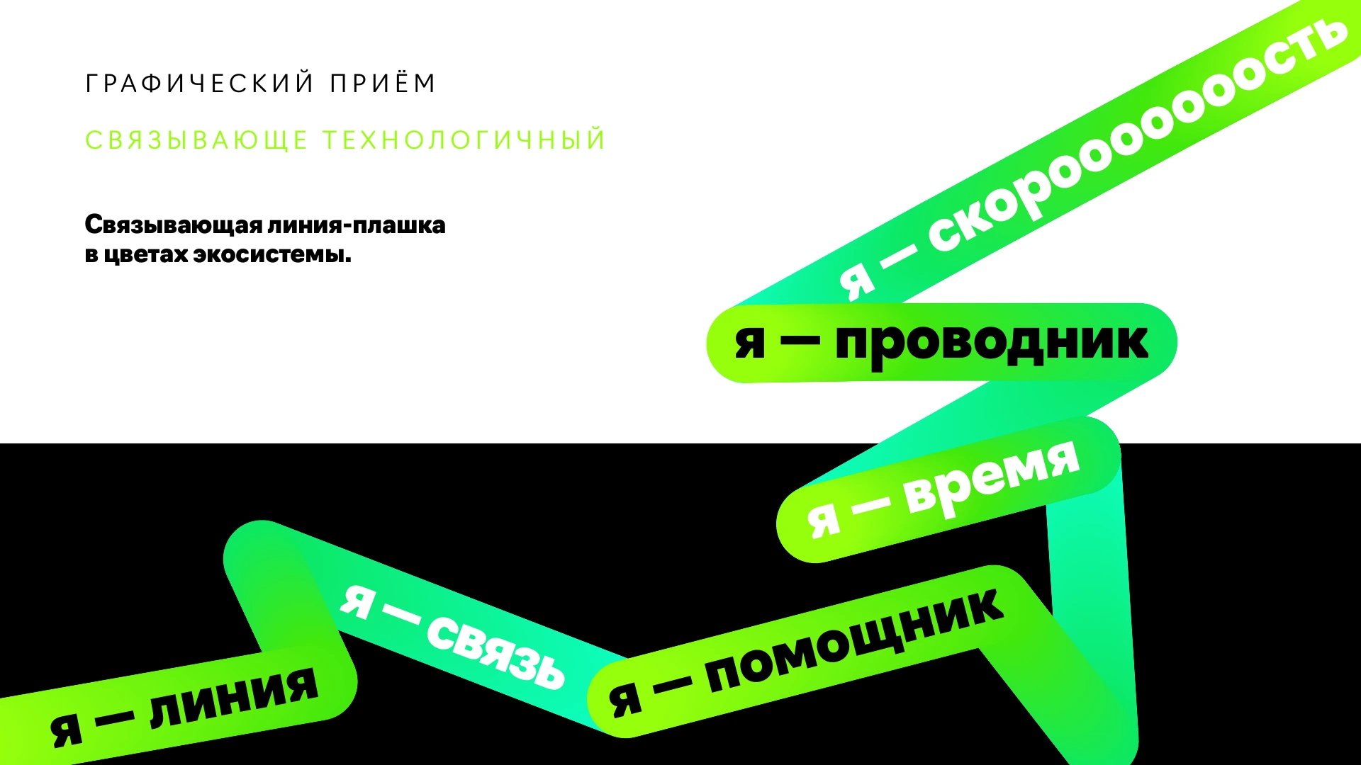
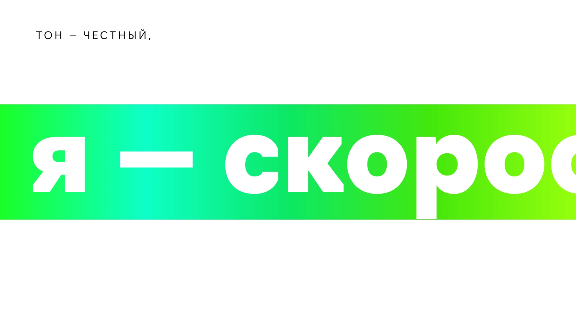
Short first-person lines—“I am a connection”, “I am a helper”, “I am a guide”—explained the service’s role. The connecting line became a flexible graphic device.

What the project delivered
An atom-based identity, writing principles, colour navigation, icons and interface rules documented in a guide.
BrodoA bar for kindred spirits