Beeline. Your voice
An employer identity that puts the person forward, with the company behind them.
Art direction and visual system
Your voice. Our support.
The beeline brief identified a gap: people knew the telecom brand, but not its working culture. The identity needed to express a place where people can propose ideas, try things and act with their team’s support.
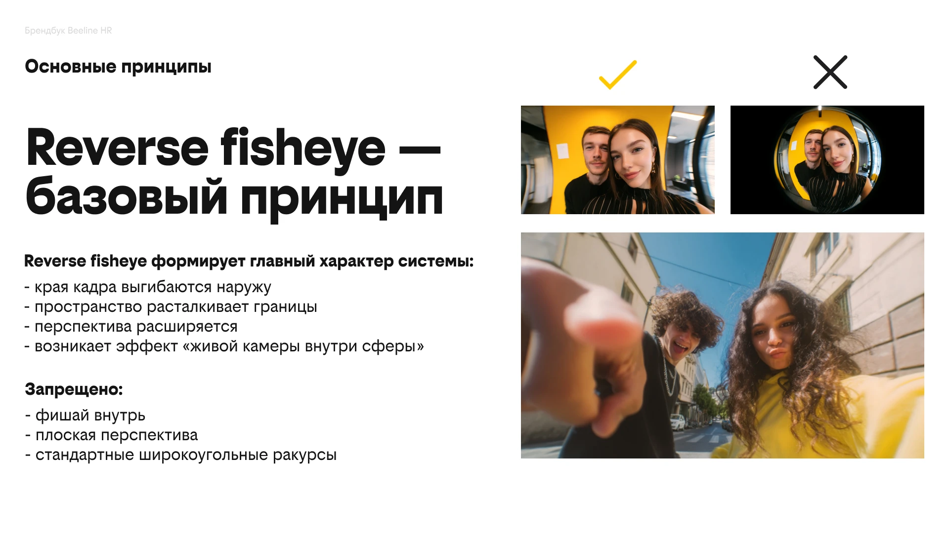
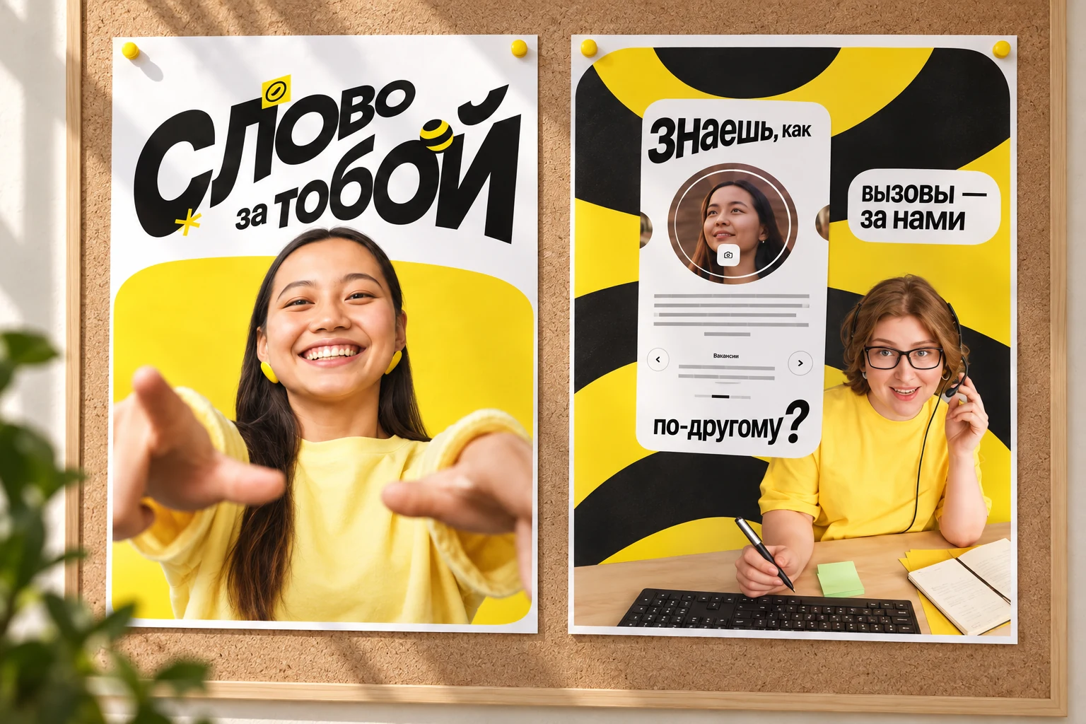
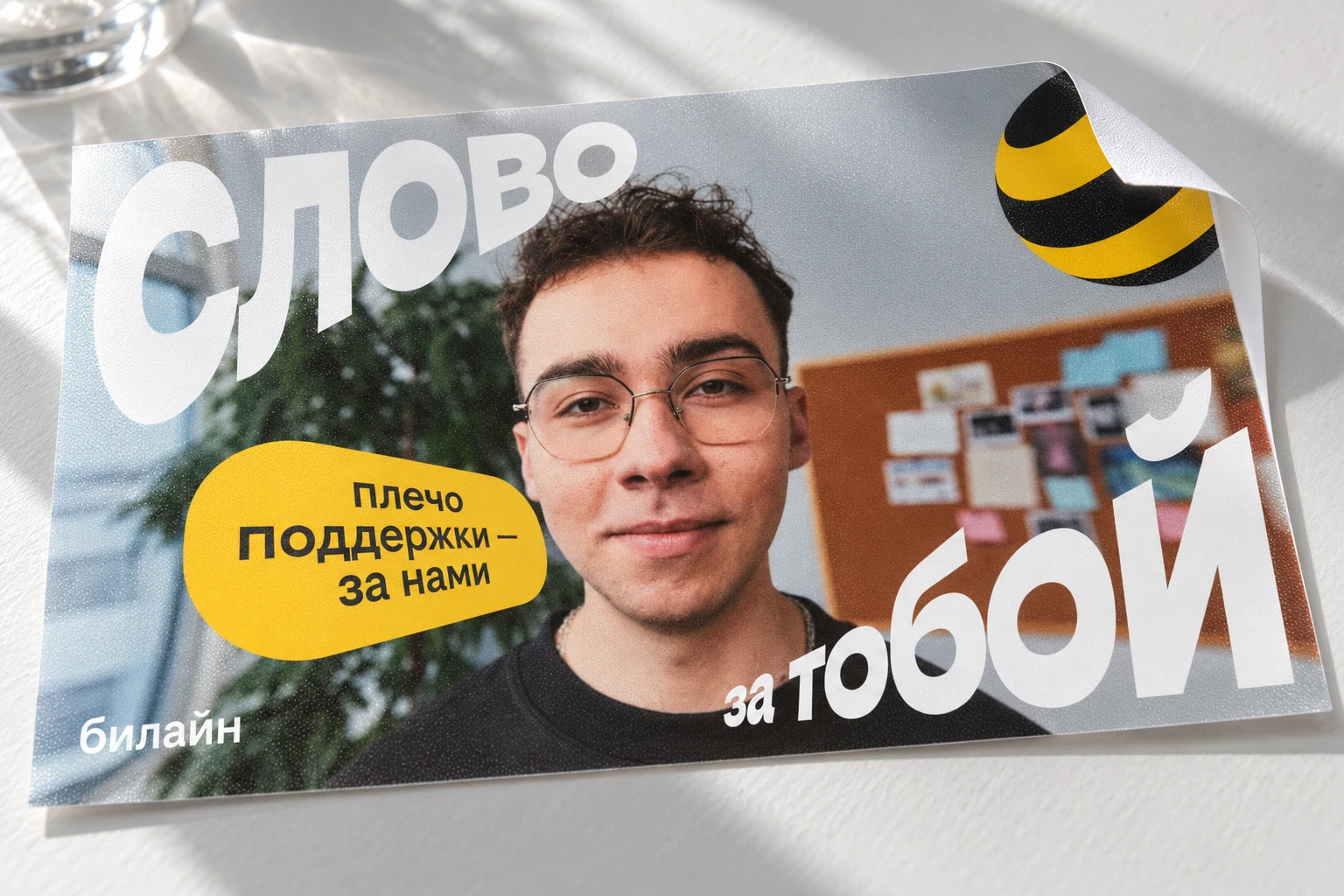
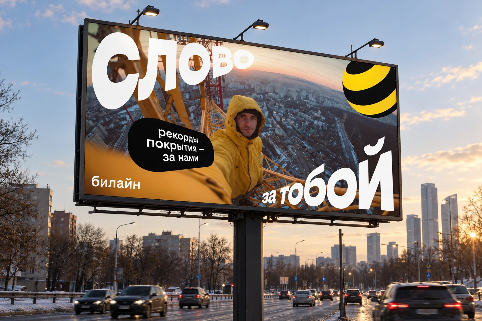
I translated that promise into a visual device: a reverse fisheye perspective brings the employee forward, with typography following their movement. The familiar yellow and black keep the company recognisable.
A person’s perspective
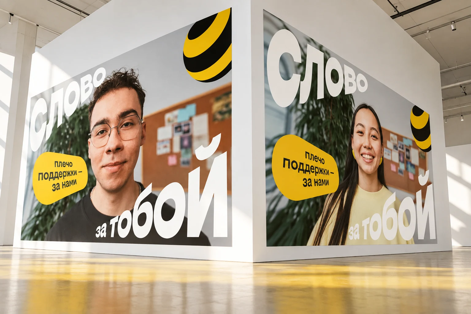
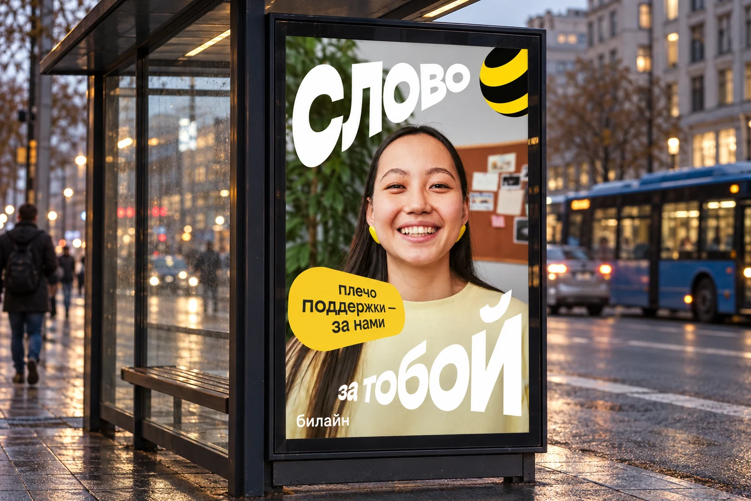
The starting point was an unusual viewpoint. Reverse perspective brings the person closer to the viewer, while the headline follows the photograph’s distortion. The same principle carries across still layouts and films.
Freedom within rules
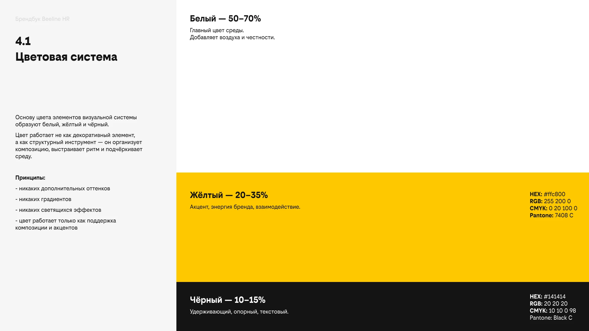
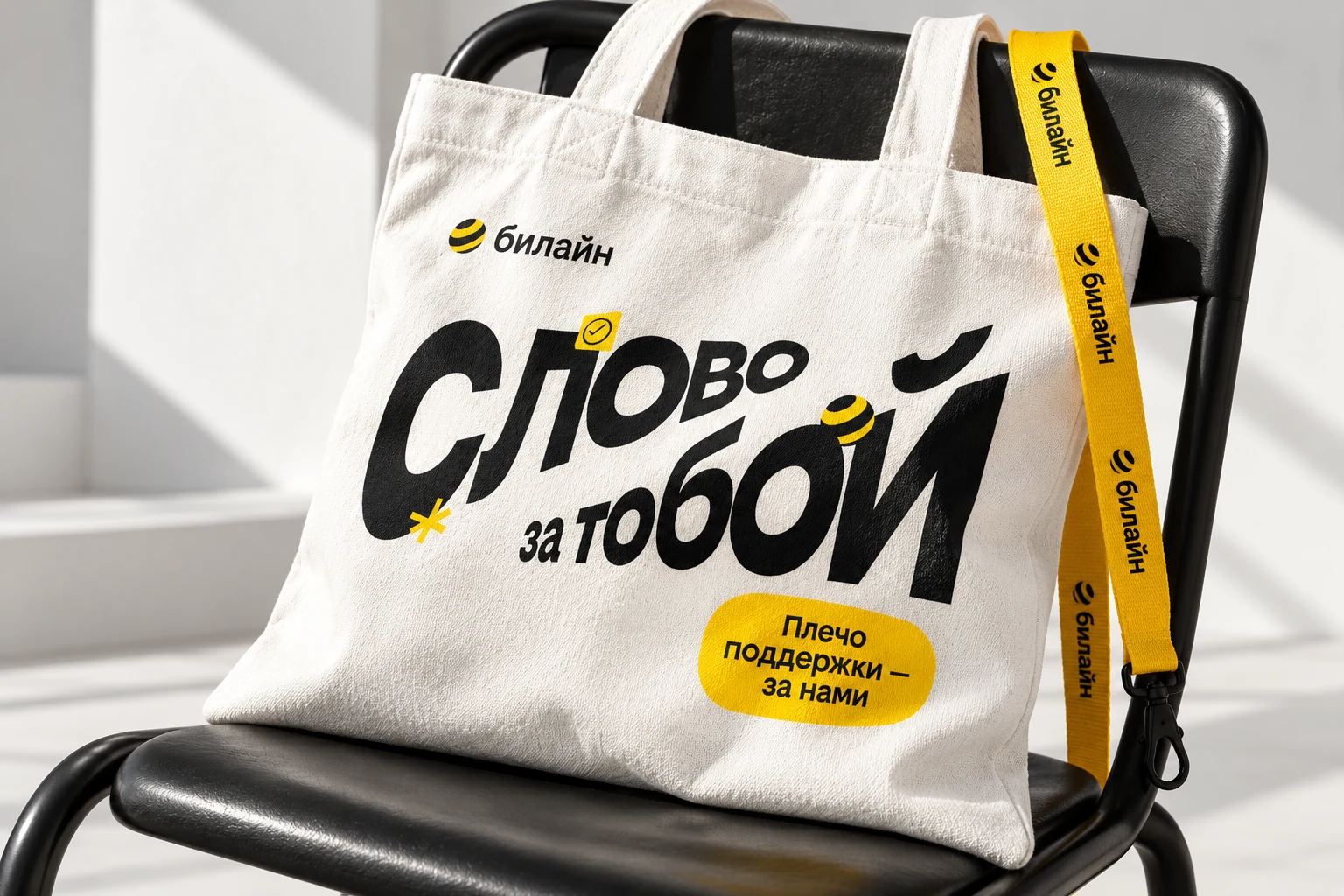
White, the brand yellow and black remain constant. Beeline Sans separates headlines from information, allowing an active composition to remain legible.
The employer promise
Messages about schedules, mentorship and support are brief employer promises. A shared formula connects different professions and situations, while each person gives the message a different tone.
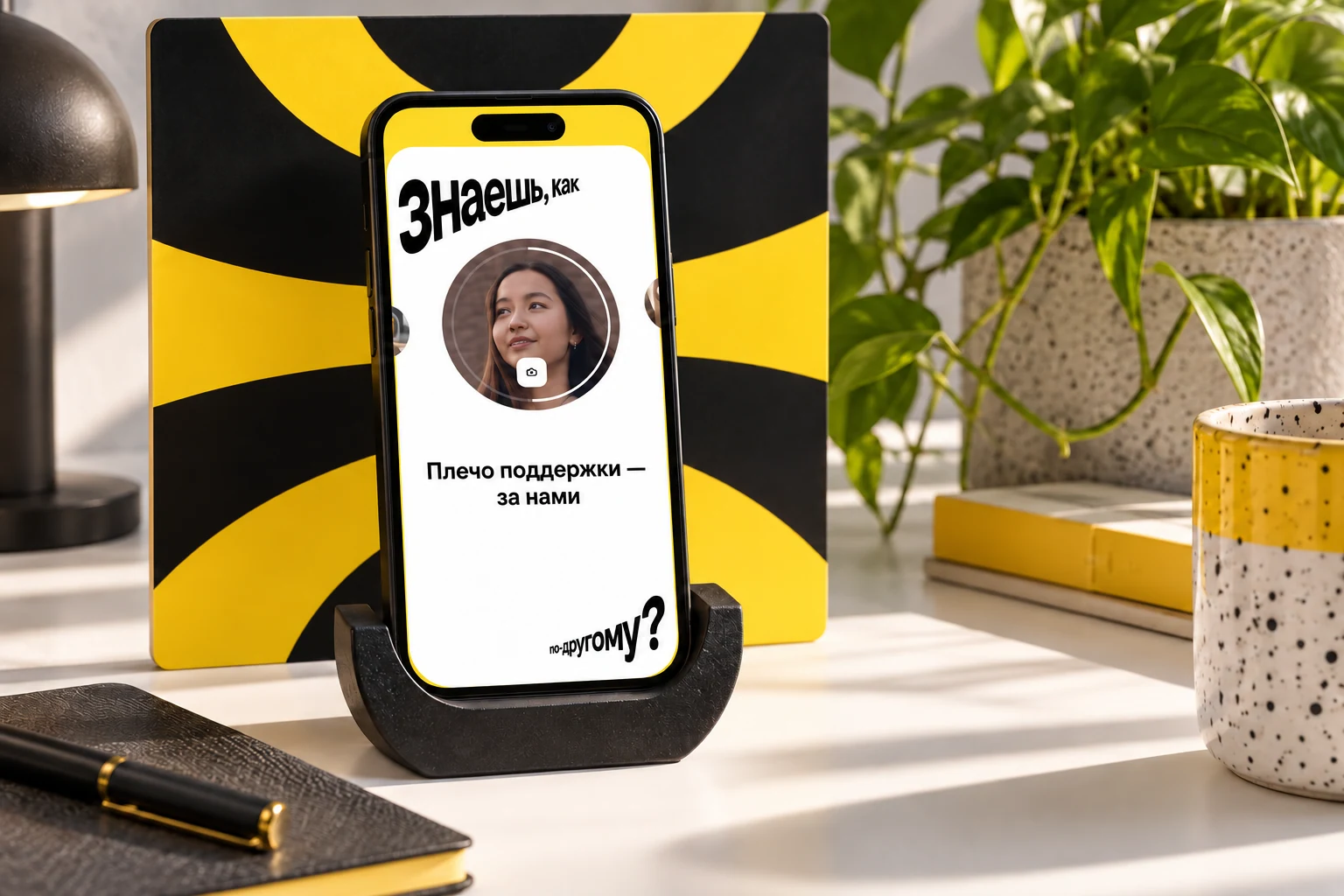
Adapting to street viewing
Outdoor formats retain the original key visuals: the person, distorted headline, sphere and short message. Carrier proportions and element placement change, extending the campaign without a new graphic language.
What the project delivered
Photography direction, typography and layout principles for recruitment, from digital messages to outdoor formats.
VESH! SHOWAlyona’s show about objects