SO:USE
Business and art find a shared language.
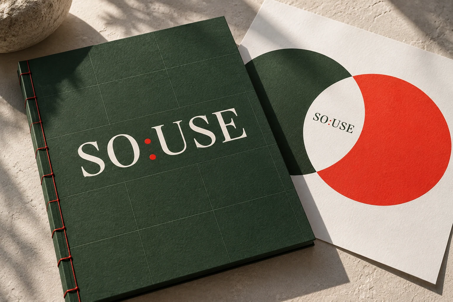
Where two worlds meet.
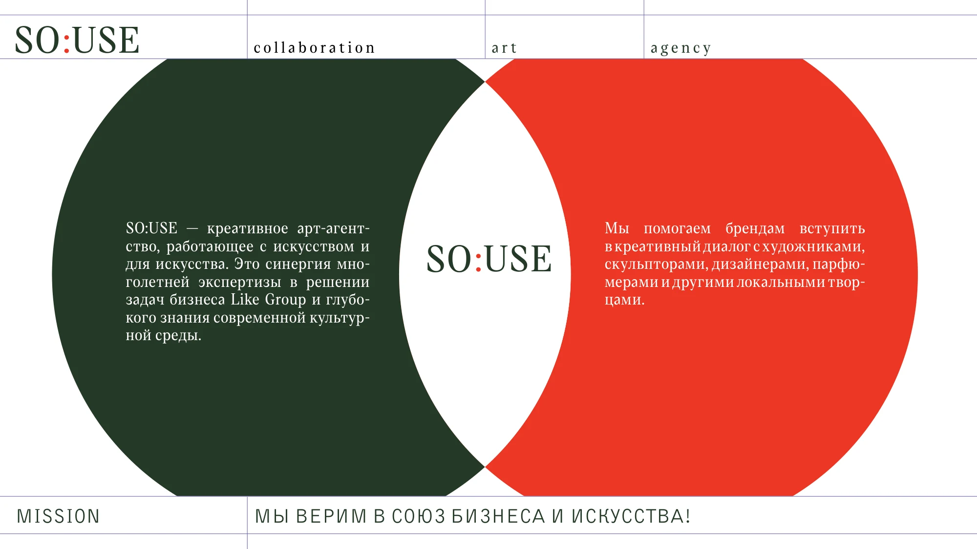
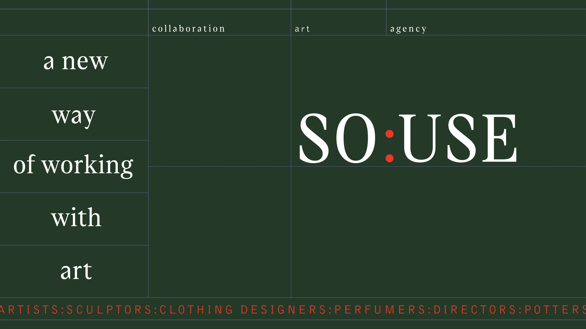
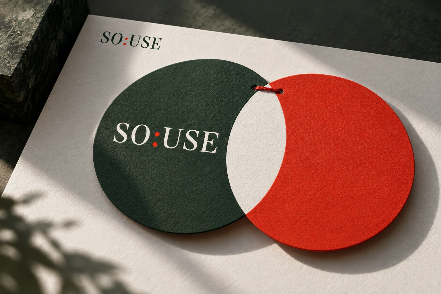
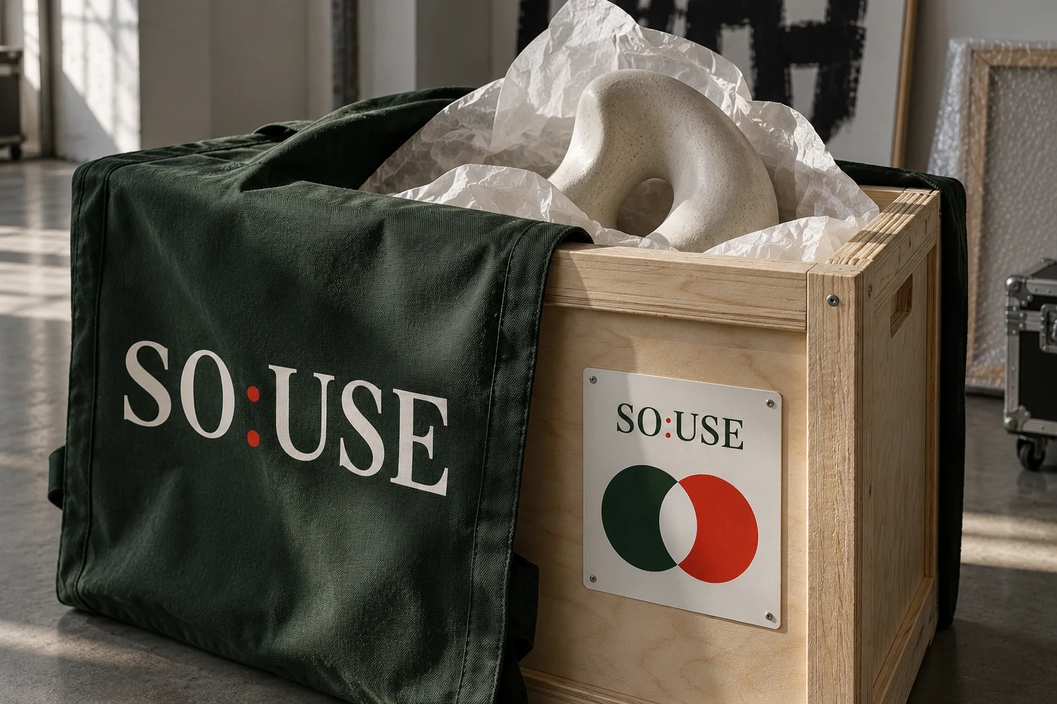
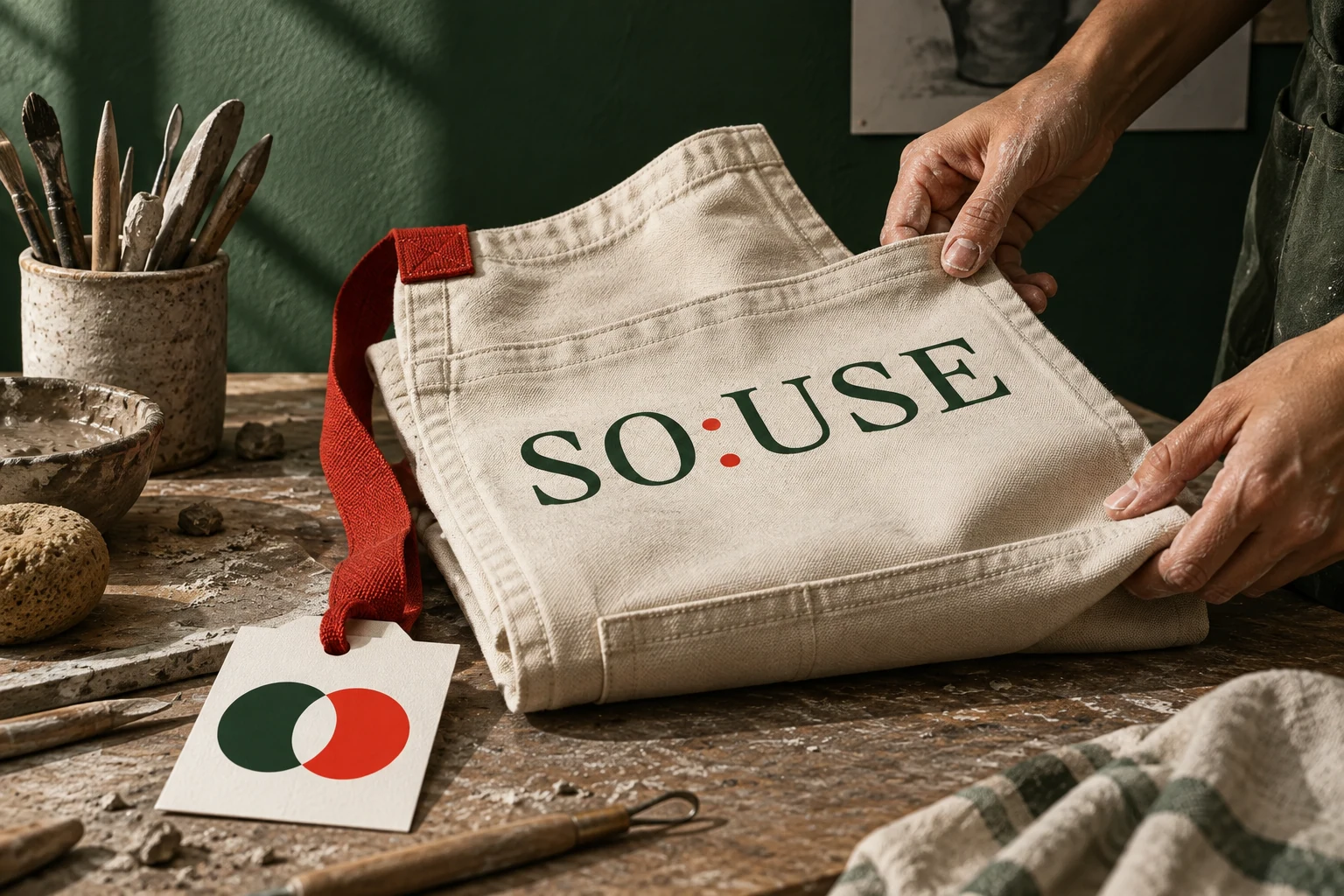
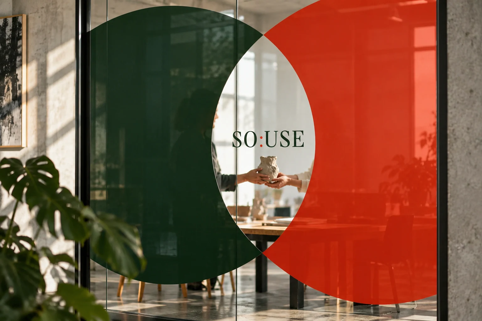
SO:USE connects brands with local artists and makers. Their meeting informs a symbol of overlapping circles. The identity provides a structure for varied work: a grid, expressive serif typography and green palette connect the material, with red marking accents. Each author retains an individual voice within the agency’s shared language.
- Designer
- Natasha Serikova
Next project
Park ProductionPresenting a future shoot