Irony Production
An agency identity and a campaign about how social media changes our lives.
Art director at Irony Production
An agency as a launch site for ideas
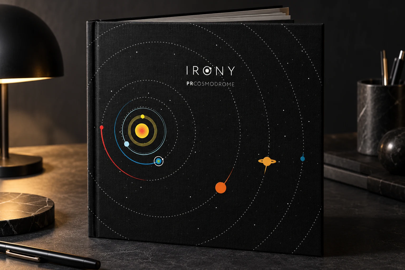
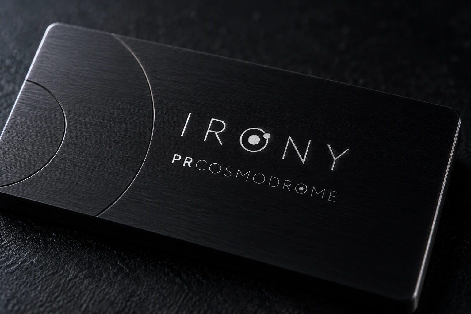
As art director at Irony Production, I developed the agency’s identity around PRCOSMODROME. The space metaphor brought the team, its disciplines and projects into one world. Orbits, satellites and a launch site express an agency that brings specialists together and sends ideas into flight.

Orbits as a shared language
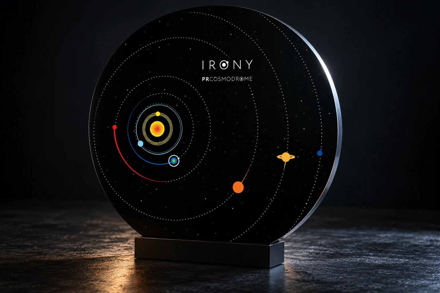
An orbital O defines the wordmark. Planets and trajectories carry its logic into the graphics, while dark space and bright blue accents connect different compositions. The identity remains recognisable in a short message and in a fuller account of the agency.
A whole world, beyond a single symbol
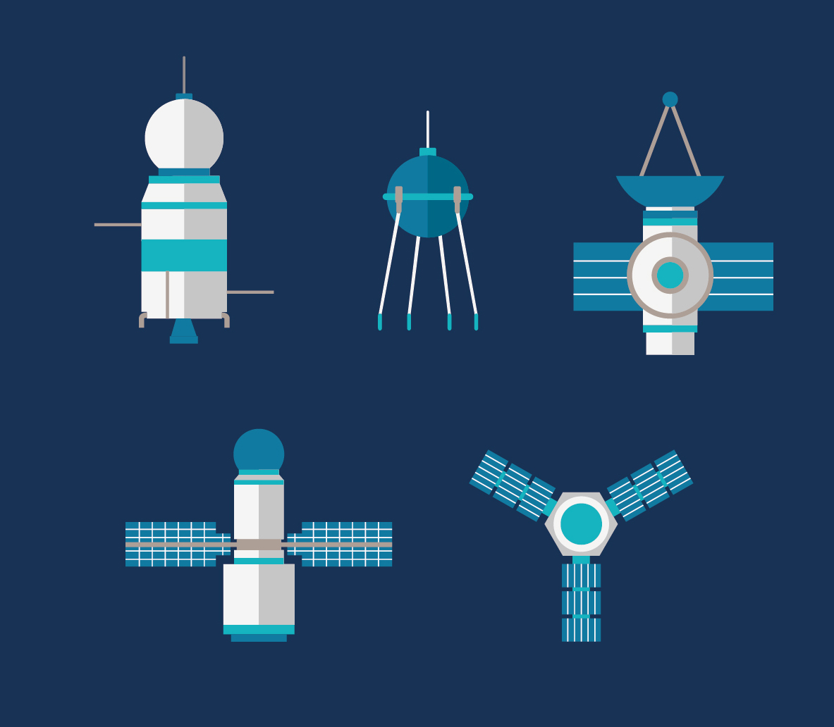
Ilya Kutoboy’s illustrations turn the metaphor into a visual language of its own. Satellites, antennas and research craft share simple geometric forms and a common palette. These elements can form new scenes while retaining the agency’s character.
A team behind every launch
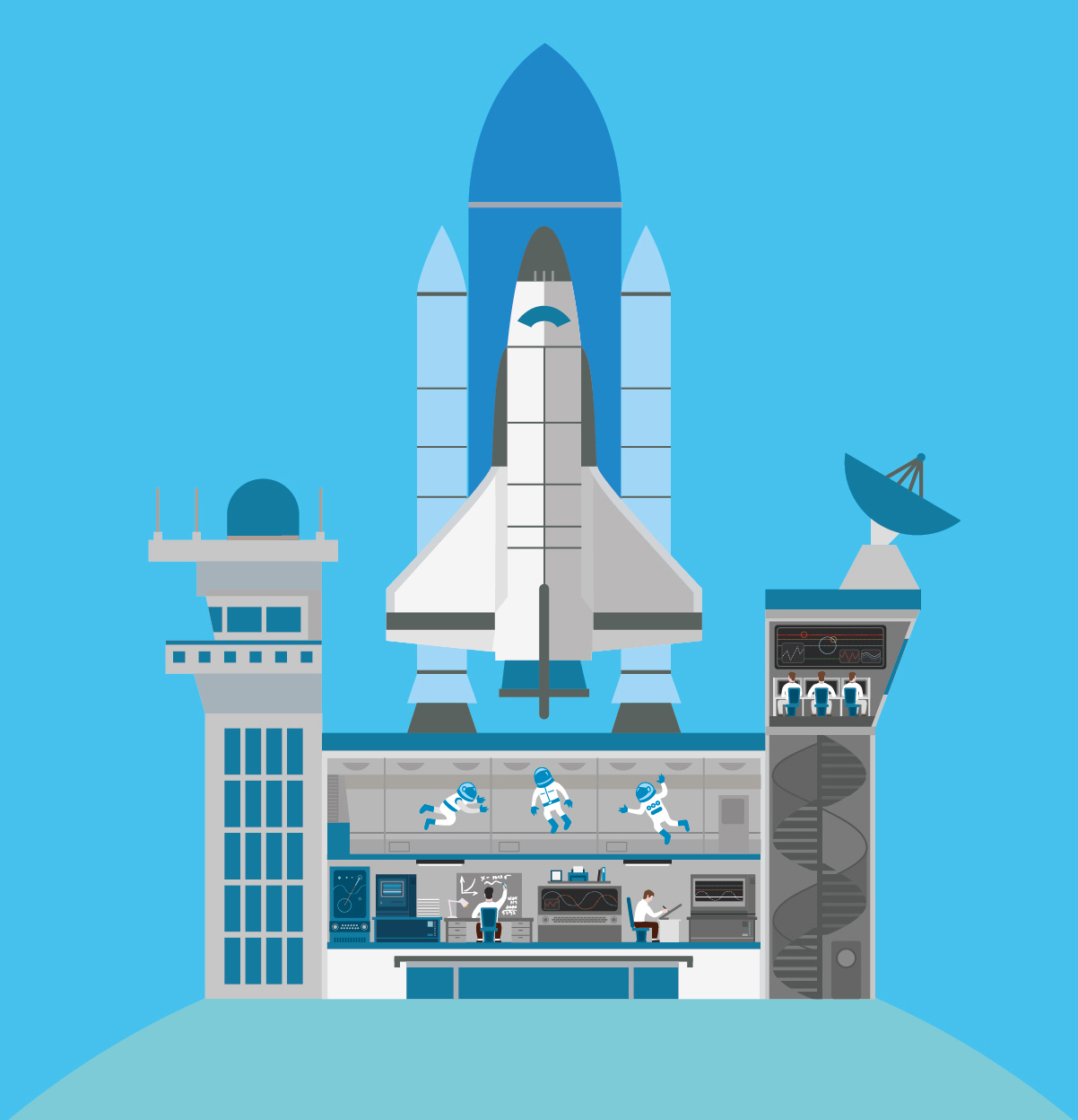
The spaceport opens in cross-section, revealing researchers, engineers and astronauts at work. The illustration makes the agency’s inner life visible: different specialists preparing one launch. The same world connects communication about the team, services and projects.
The identity in communication
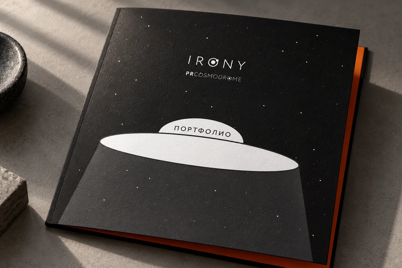
The agency presentation uses this space world to guide the story through an introduction, disciplines, projects and team. A flying saucer marks the move into the portfolio. It is one application of the identity, using illustration for navigation and a consistent tone.
A life measured in likes
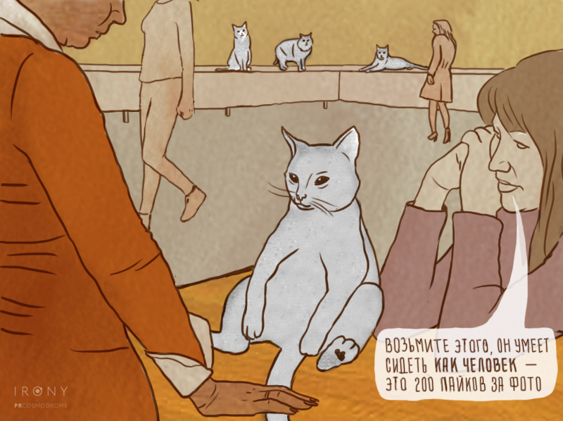
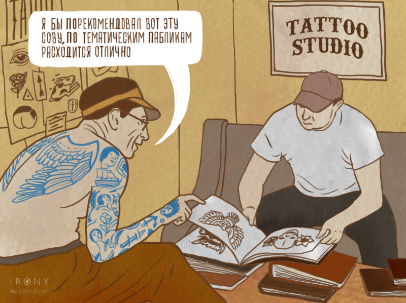
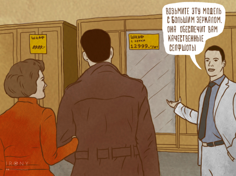
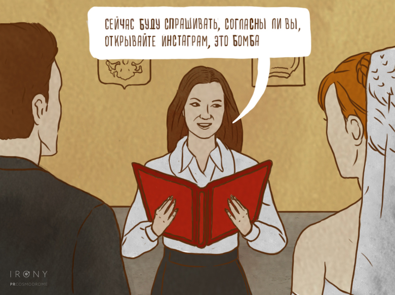
In “They thought about it and sat like humans”, familiar scenes become quietly absurd: a cat, a holiday and even an unborn child are valued by their potential likes. We brought social media’s logic into everyday life to show how the anticipation of other people’s reactions begins to shape personal choices.
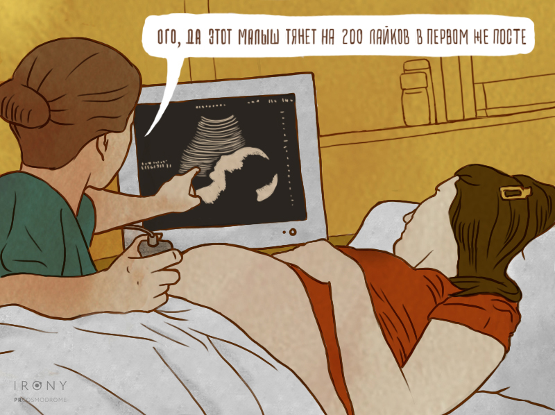
Familiar situations, a different motive
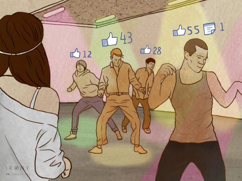
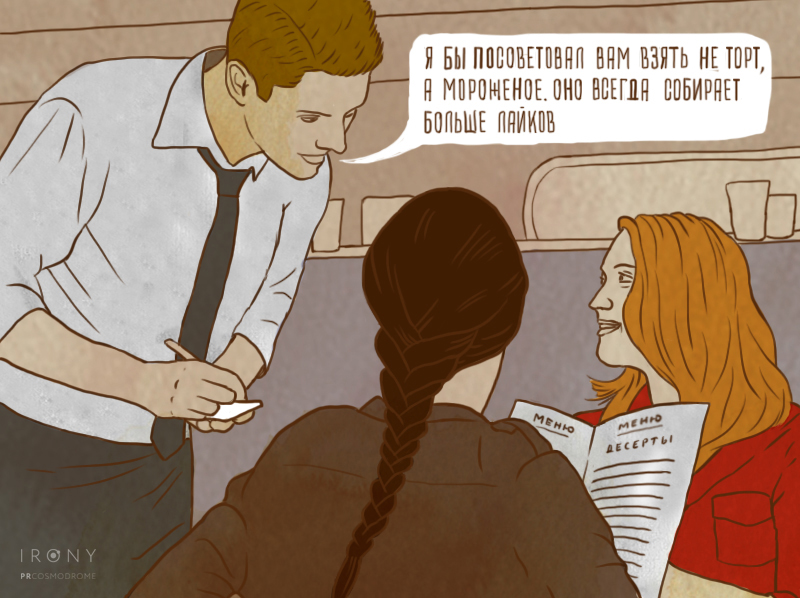
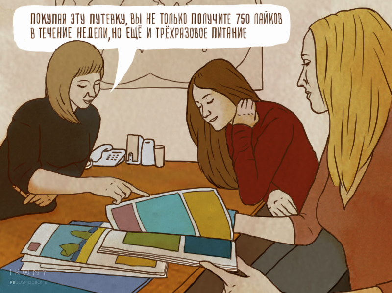
Popularity counters appear in a dance class. A waiter recommends the dessert that performs best in a feed. A travel agent bundles likes with a holiday, while a tattoo artist chooses a design for its chances of being shared. Each scene works on its own and develops the series’ central idea.
From everyday choices to life events
The eight-image series ends with a mirror bought for selfies and a wedding staged for a post. The irony depends on image and line working together. I selected the illustrator and directed the visual work so that each scene aligned with Misha Kafanov’s copy.
A conversation with TJournal
Following the attention the series received, I spoke with Nikita Likhachev for TJournal about becoming a designer, working at Irony Production and making this campaign: from choosing an illustrator to bringing copy and image into one story. The interview was published on 14 November 2013; an archived version is linked below.
What the project delivered
The PRCOSMODROME identity and an eight-image campaign about social media’s influence on everyday life.
- Art direction and agency identity
- Semyon Kirilin
- Illustrations
- Ilya Kutoboy
- Campaign copy
- Misha Kafanov
Evolution of WritingSymbols in stop motion