Current · city portal
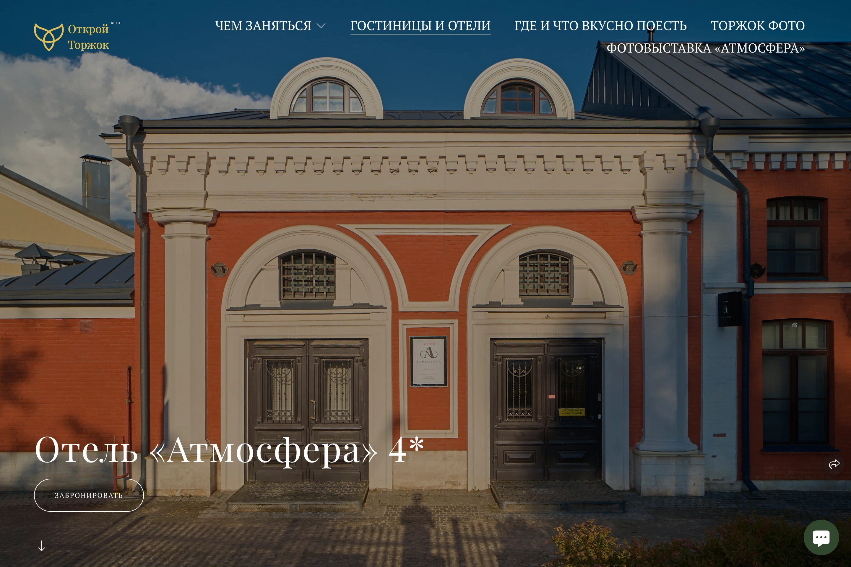
Information about a hotel
A building photograph, general benefits and a booking link. Guests piece together the rest of their trip themselves.
visit-torzhok.ru ↗Turn a stop along the road into a trip in its own right. Positioning, visual identity and a working website for a small hotel, from first interest to choosing a room and dates.
Positioning, visual identity, copy and website development
Working version of the hotel’s new website.
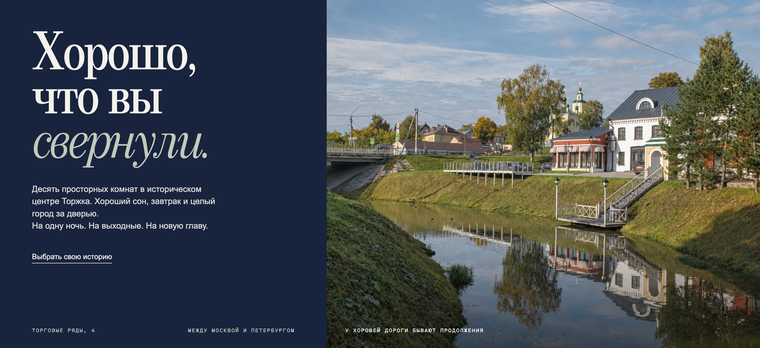
Atmosfera already has the ingredients of a good story: ten different rooms, the historic Trading Rows, water outside the window and a town between two capitals. I connected these qualities to the guest’s wish to escape a familiar rhythm. “A turn worth taking” becomes both an invitation and the website’s principle: each turn reveals another reason to stay.
The city portal presents the hotel through its amenities. Our version introduces a point of view: a reason to turn off the road, a sense of place and a clear continuation. The transformation is in how the hotel presents itself, speaks and helps people choose.
Current · city portal
A building photograph, general benefits and a booking link. Guests piece together the rest of their trip themselves.
visit-torzhok.ru ↗Our proposal · working website
First, the desire to visit. Then your own pace, a specific room, walks and dates. One voice guides the whole experience.
netorzhok.vercel.app ↗The website follows the decisions people make: imagine a trip, choose its length, find a room and select dates. Switch between the steps to see how they connect.
Place, character and the promise of a stay welcome the guest before the list of amenities.
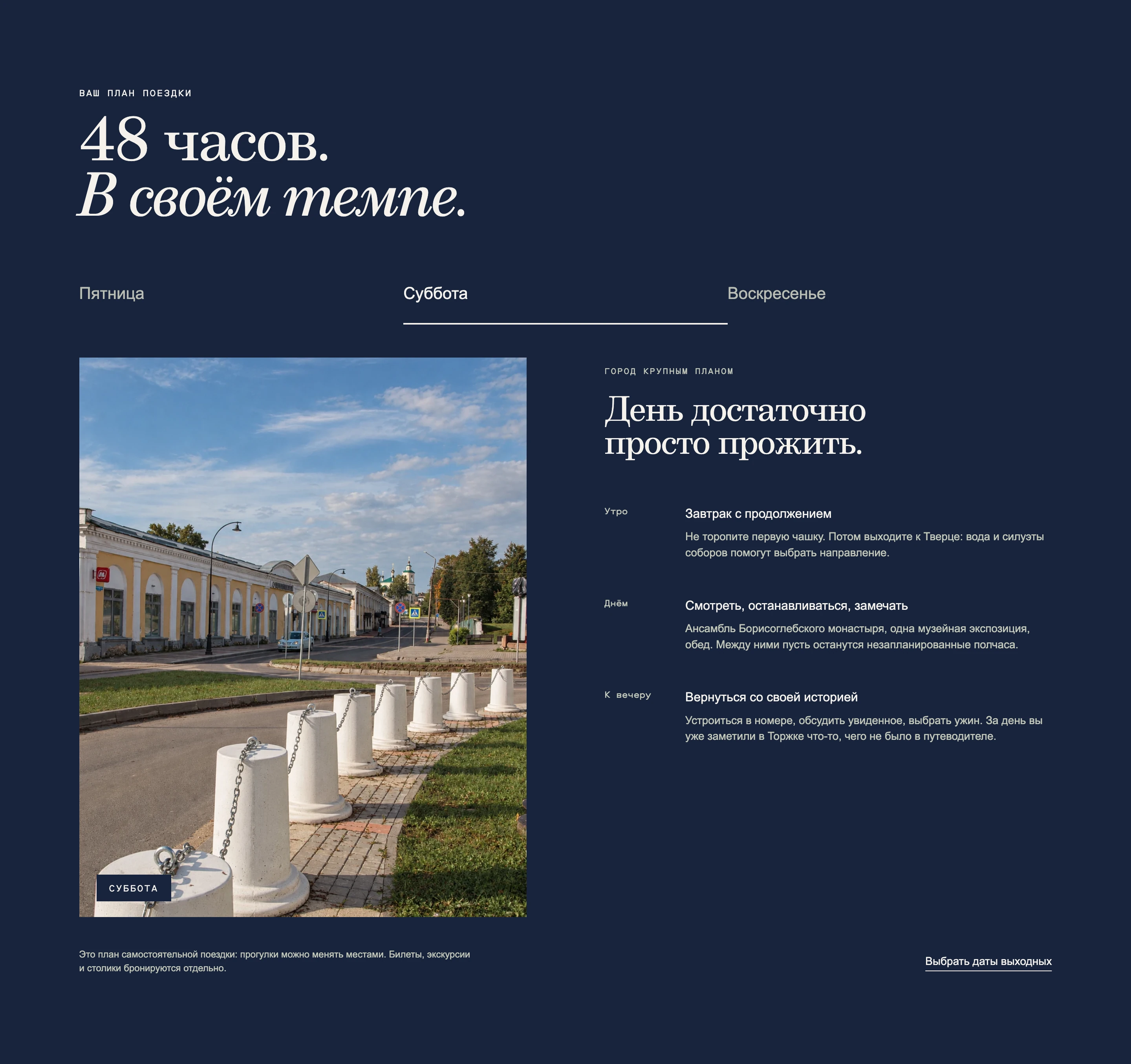
The 48-hour scenario unfolds day by day: travel and settling in on Friday, the town on Saturday, an unhurried ending on Sunday. It leaves room for personal discoveries while addressing practical questions such as a late arrival, dinner or rain. Hospitality begins before check-in.
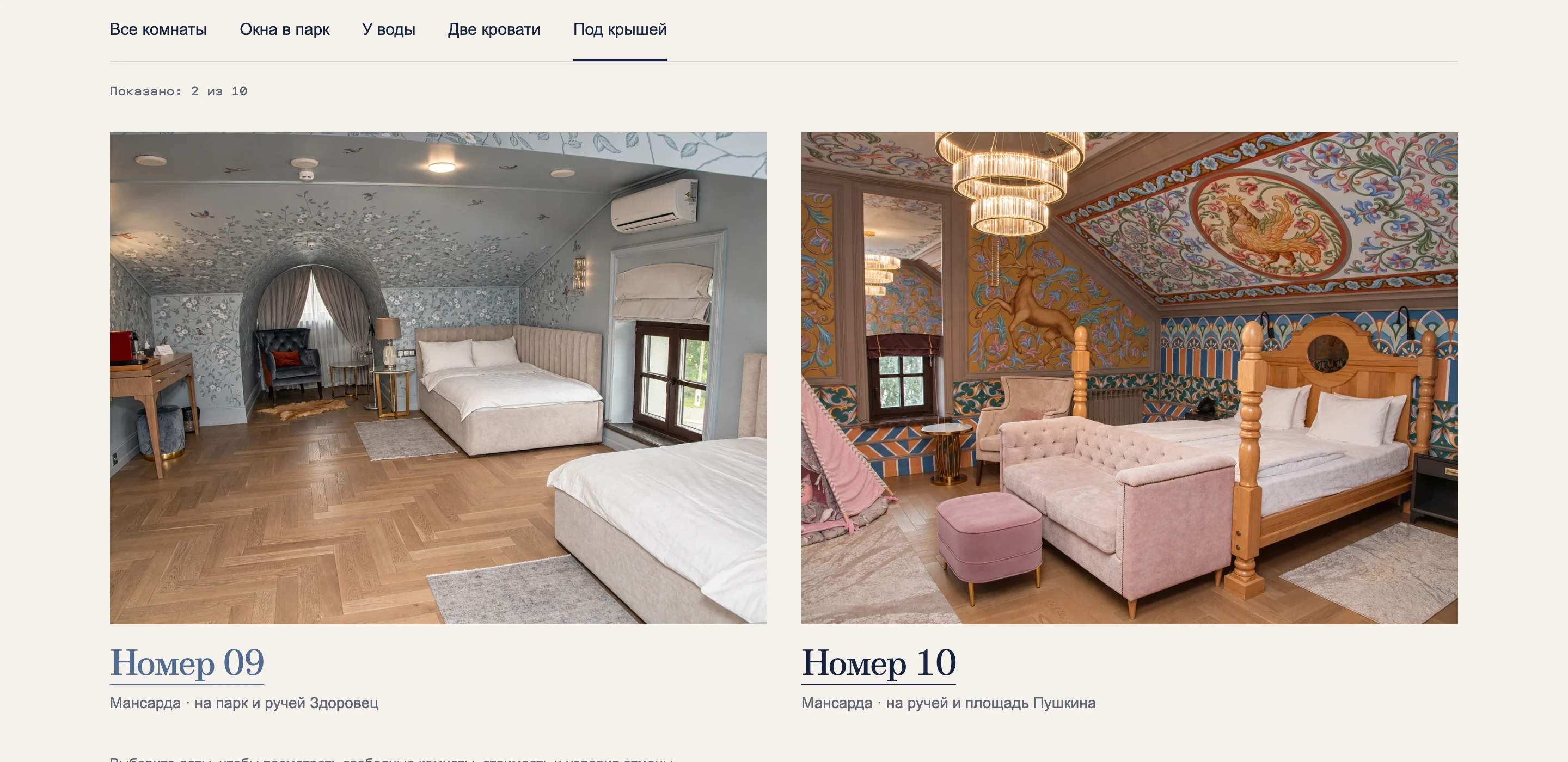
A category name rarely explains what makes a room different. Here, selection starts with practical preferences: park or waterside views, twin beds or an attic room. Each room has its own gallery, floor area and outlook. The chosen room carries through to booking.
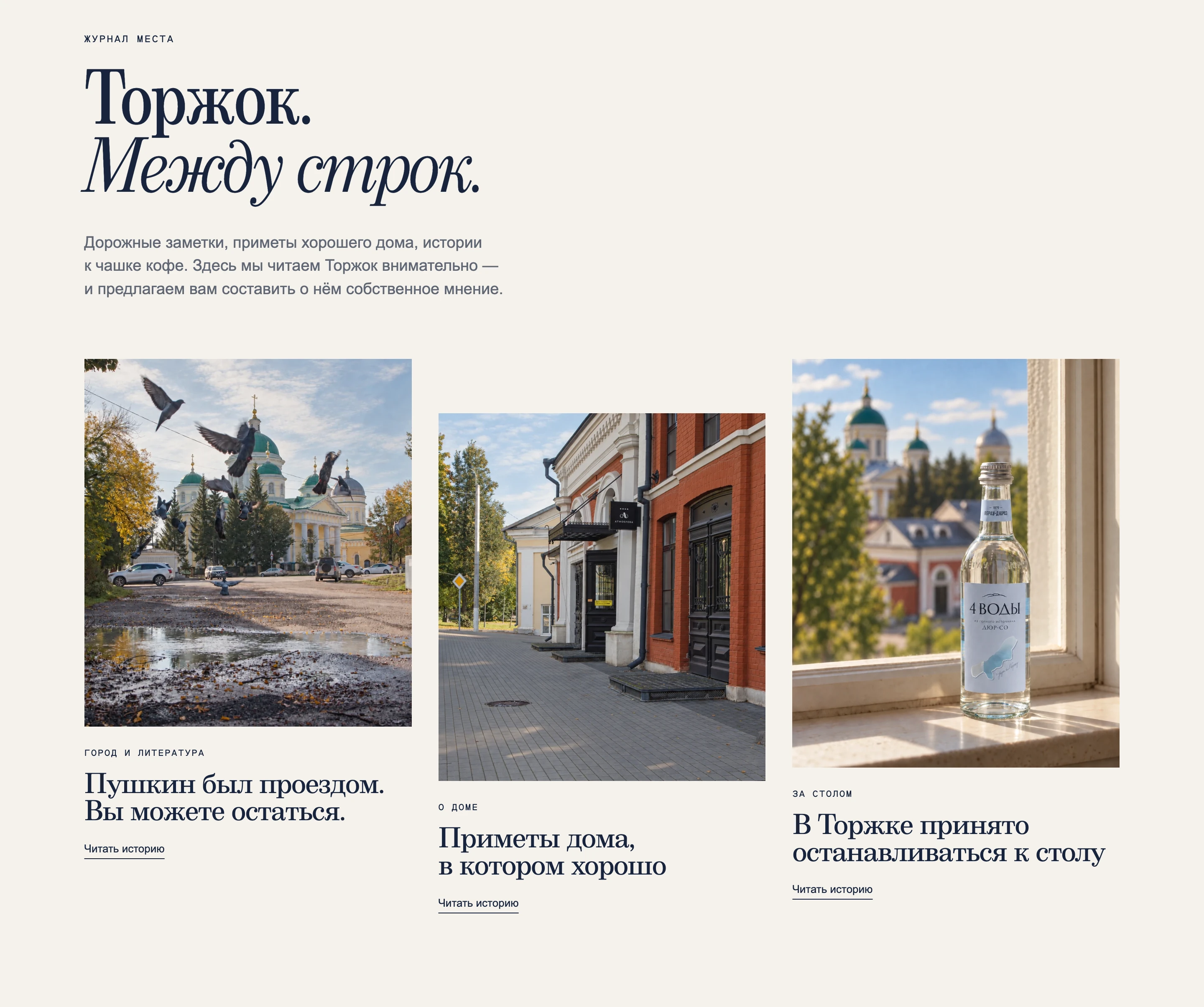
The journal carries the same attentive voice, grounded in details rather than stock promises. Architecture, local stories, food and the small signs of a welcoming home give people reasons to linger. Deep blue, warm paper, large serif type and real photographs connect the rooms and town into one identity.
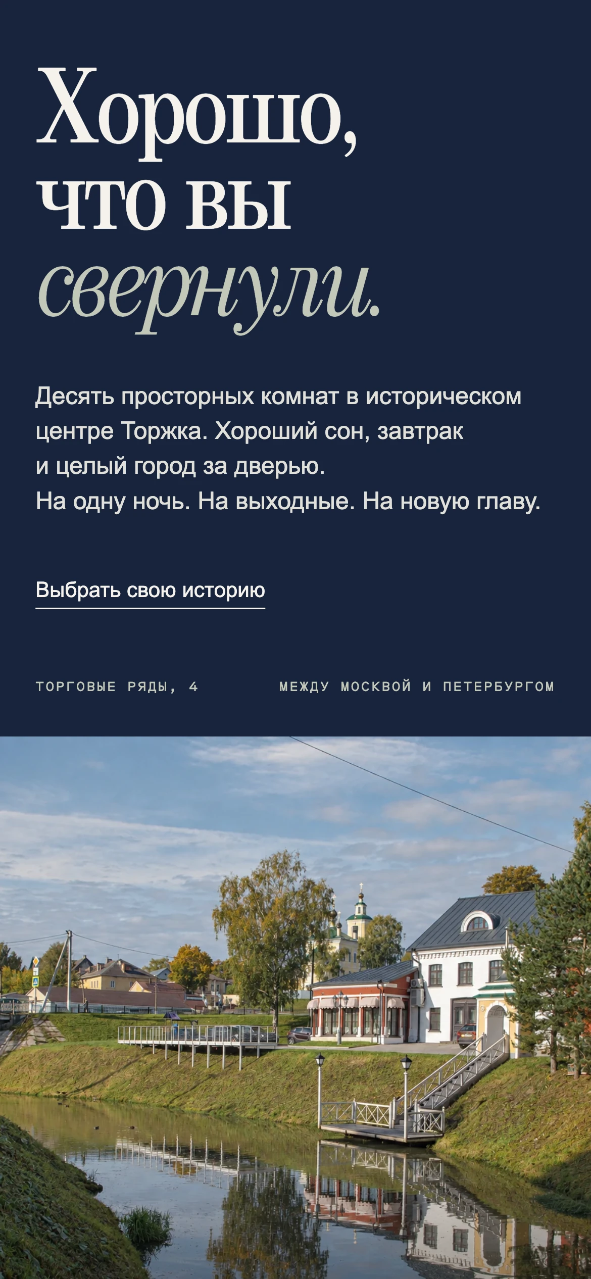
On a small screen, both the character and sequence of choices remain intact. The invitation, photography, room details and dates stay part of one story that can continue on the road.
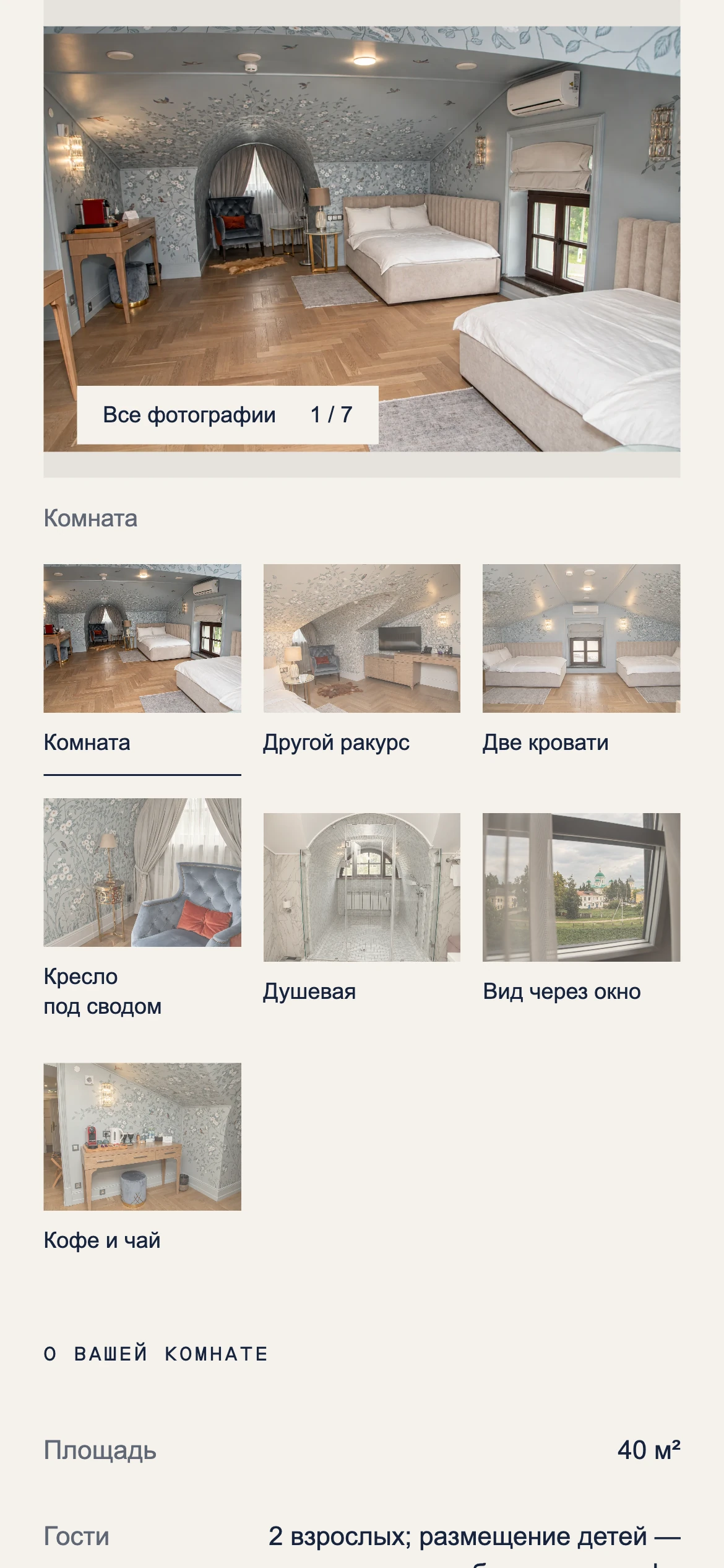
A working website with three stay scenarios, ten detailed room pages, a weekend planner, a journal and a booking handoff that preserves the selected room.